 Signin


Tree Map
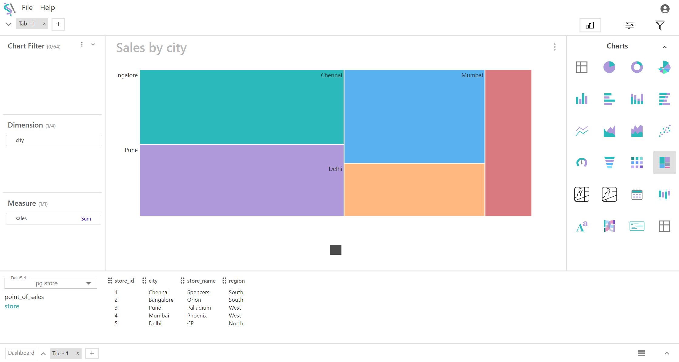
A tree map is a data visualization tool used to represent hierarchical data using nested rectangles. Each rectangle's size corresponds to a measure, and its color can represent additional data. When using a tree map with four dimensions and one measure, the hierarchical structure is defined by the combination of these dimensions, while the measure provides quantitative information about each segment.
Key Fields of a Tree Map
- Define the hierarchy and structure of the tree map. Each dimension represents a level of hierarchy, helping to categorize and subdivide the data. Dimensions are organized into a hierarchical structure from the highest to the lowest level, affecting how the rectangles are nested and displayed. The hierarchy typically starts with the broadest category and becomes more specific as the dimensions are added.
- City, Region, Country, Product Category, Product
- Represents the quantitative value associated with each segment of the tree map. The size of each rectangle in the tree map is proportional to the measure value, allowing for easy comparison across dimensions. Provides insights into the magnitude or performance associated with each segment in the hierarchy.
- Sales Revenue, Sum of sales, Sum of profit
You can display a maximum of Four Dimension and One Measure in your chart/table.
When to Use a Tree Map:
- Ideal for visualizing complex hierarchical data with multiple levels of categorization. Helps in understanding how values are distributed across different levels of the hierarchy.
- Useful for comparing quantitative measures (e.g., sales revenue) across different categories and subcategories, allowing for quick identification of high and low performers.
- Effective for exploring data and understanding the relationships between different dimensions and how they contribute to the overall measure.