 Signin
Introduction to Charts
Visualizing data is essential for gaining insights and understanding complex datasets, and our platform offers a rich set of charting tools to meet your visualization needs. Whether you're creating simple bar charts, line graphs, or complex pie charts, our charting library provides the flexibility and customization options you require. With support for interactive features such as zooming, panning, and data filtering, our charts enable users to explore data in-depth and uncover hidden patterns or outliers. Export charts in various formats for presentations, reports, or further analysis, ensuring that your insights are effectively communicated to stakeholders.
Charts
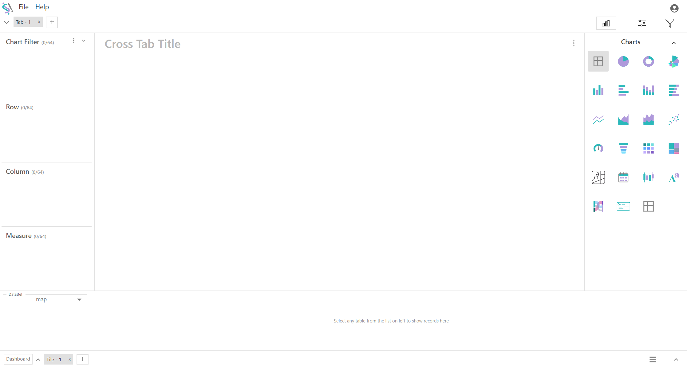
Click the below Charts icon at the top right to view all available charts, then select the chart that you want. It's open by default.
Under Charts, there are multiple chart options available for visualizing your data. The up arrow (^) next to the Charts label is used to hide the charts window.
Data Visualization
Data visualization is the graphical representation of information and data. It aims to make complex datasets more understandable and accessible through visual cues like charts.
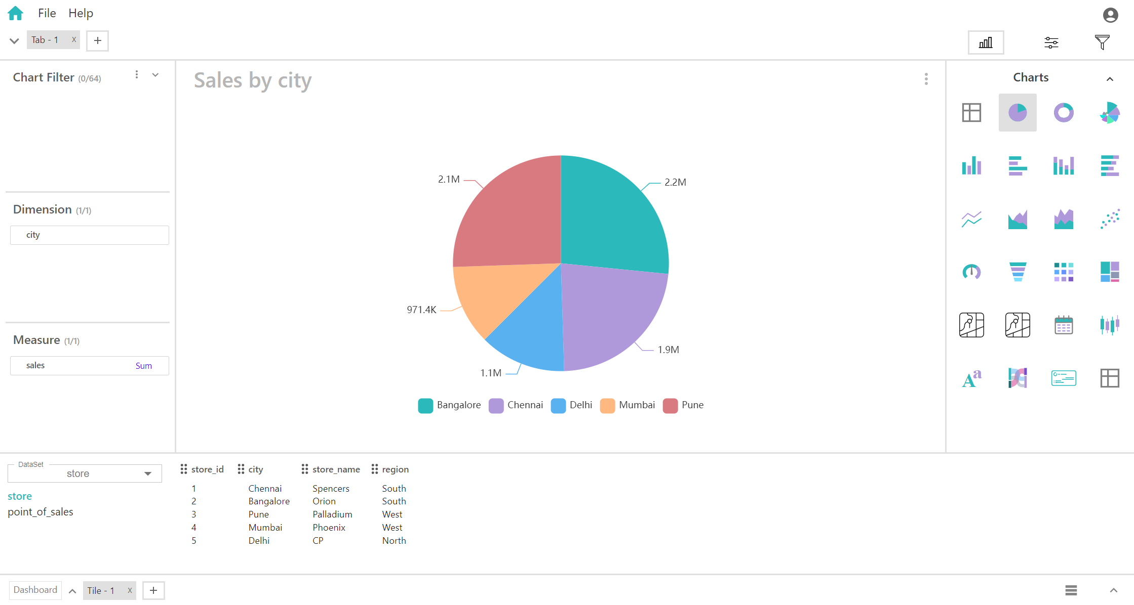
In Silzila, to visualize data, each chart (except for crosstab and table) should have at least one field in both the dimension and measure.Steps to visualize your database data and flat file data into charts:
Select a field's from created Dataset available in bottom left.
Get field's you want to visualize in chart by clicking the relationship data's under dataset and then you can get field's according to that data.
Drag and Drop field's at bottom to Dimension box at left. According to allowed number (allowed number vary chart to chart) you can drop number of field's in dimension.
Drag and Drop field's at bottom to Measure box at left. According to allowed number (allowed number vary chart to chart) you can drop number of field's in measure.
It allows users to dynamically control which data is displayed on a chart by selecting or deselecting specific categories, exploration of datasets with ease.
Dimension
The Dimension or X-axis and Y-axis represent different dimensions of the data. The X-axis typically displays independent variables or categories, while the Y-axis represents dependent variables or measures. By assigning data to these axes, users can visualize relationships, trends, and comparisons between different aspects of the data, facilitating insights and analysis.
Except crosstab and table for all charts you should fill dimension and measure with atleast one field, then only you will get data visualization.
Measures represent quantitative data or numerical values.
Fields that are suitable for measures often include:
- Numerical data: such as sales revenue, quantity sold, profit margins, etc.
- Aggregated data: such as sums, averages, counts, etc., derived from numerical data.
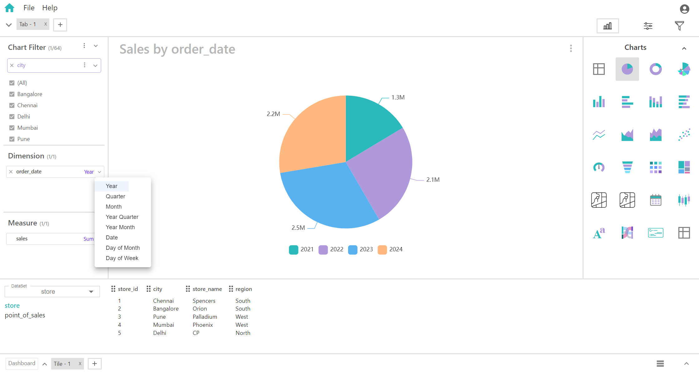
Based on the data type of fields within a dimension, various options will be available. For instance, for data types such as timestamp and date, specific manipulation options for charts will be accessible, while other data types may not offer any manipulation options.
- Year
- Quarter
- Month
- Year Quarter
- Year Month
- Date
- Day of Month
- Day of Week
Fields With Other Datatypes
Fields with other data types do not offer any manipulation options (e.g., Datatypes – Number, Text, etc…).
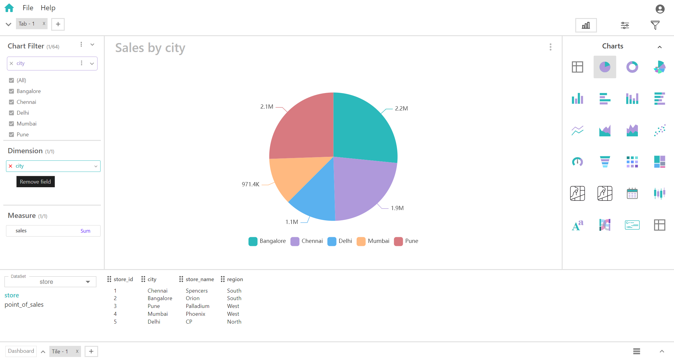
Remove Field in Dimension
"Remove field" in dimension removes a selected data field from the visualization, refining the chart by excluding specific data elements, streamlining analysis and focusing on key insights.
Measure
Fields placed in the measure area are used to quantify the data. They provide the numerical values visualized in the chart, often representing metrics, performance indicators, or other quantitative aspects of the data.
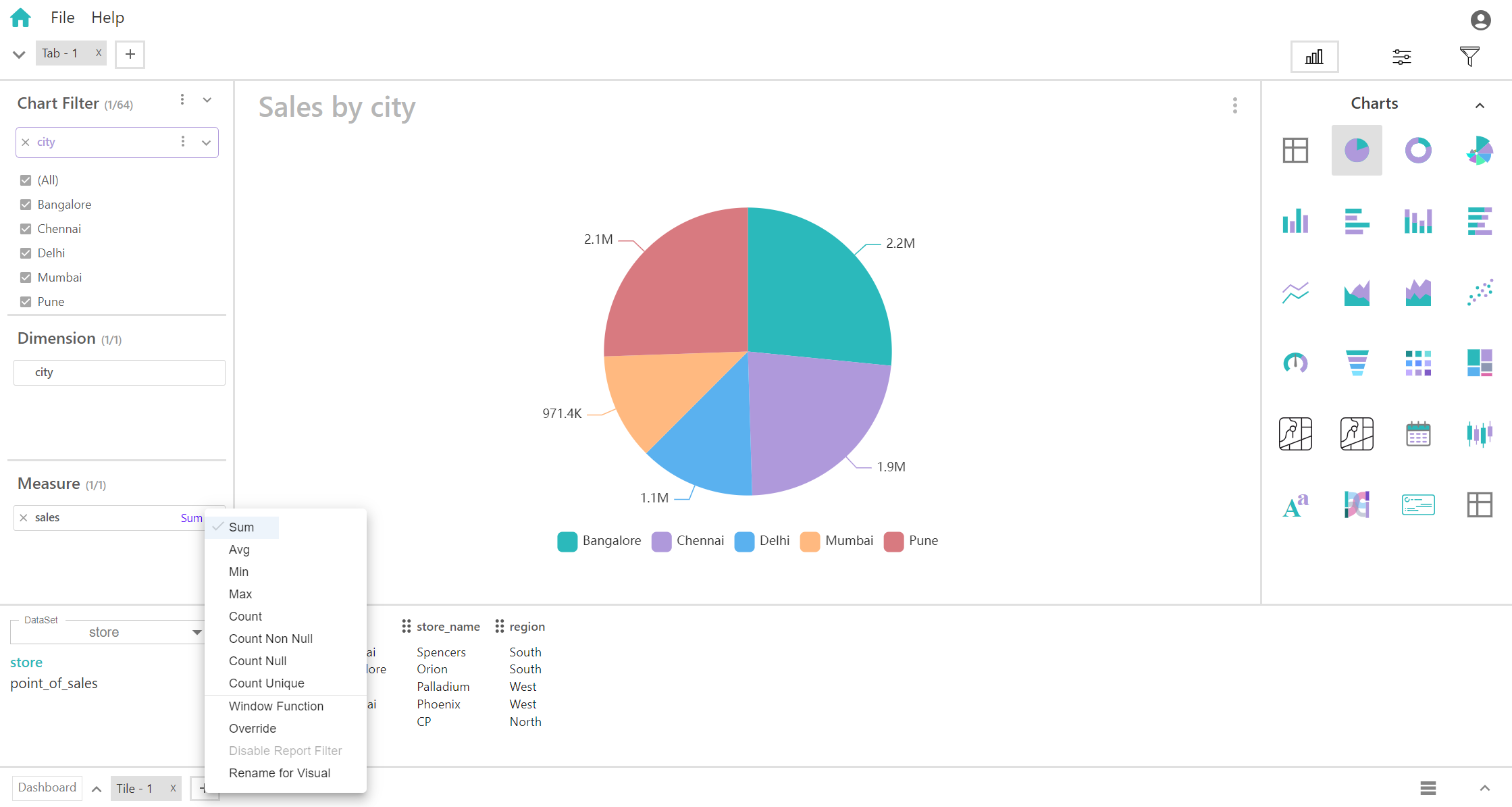
Fields in Measure
The Measure Box offers both Aggregator and Window function options, applicable to all data types. “Aggregator options may vary or based on field datatype”.
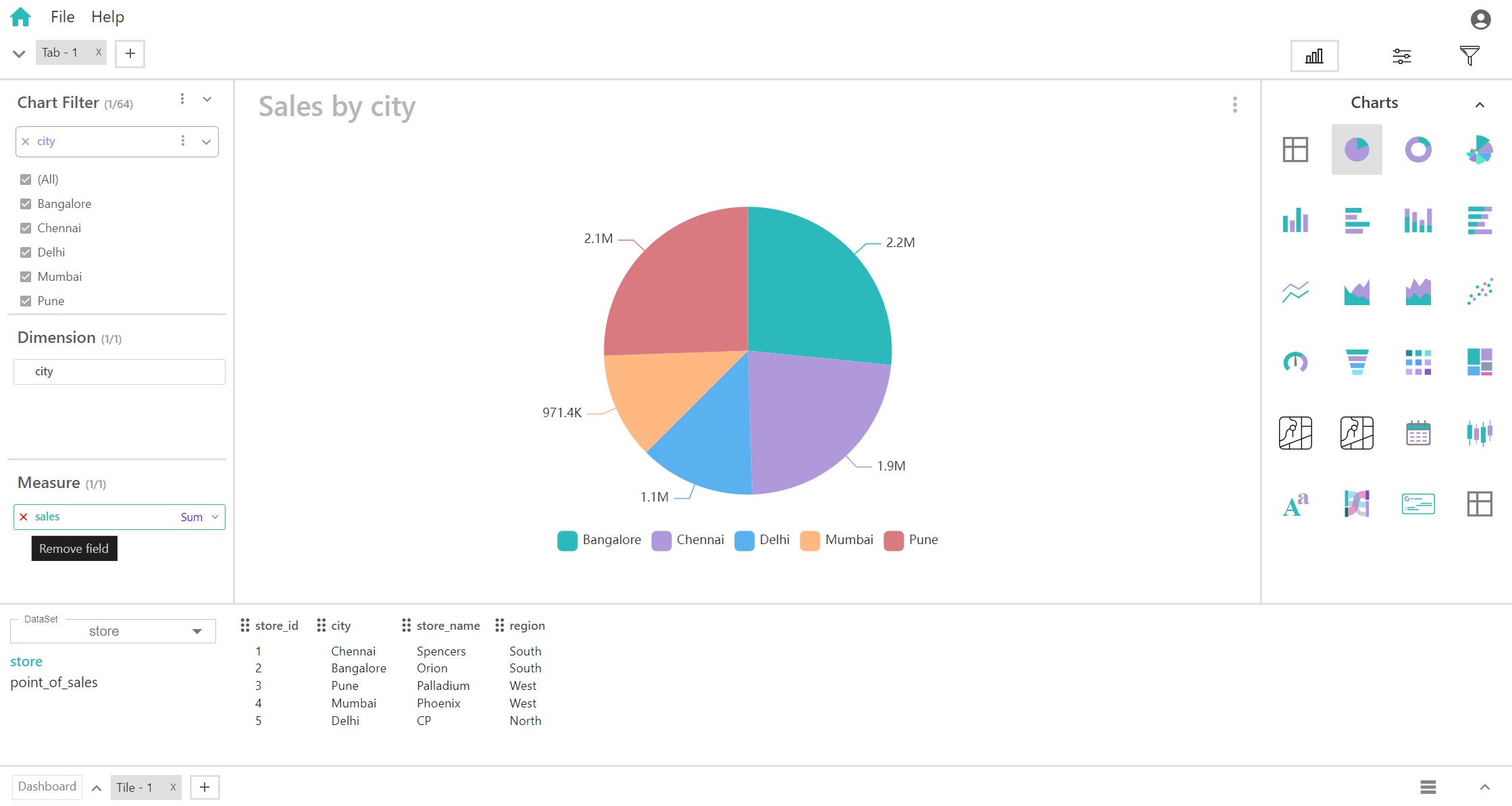
Remove Field in Measure
"Remove field" in Measure removes a selected data field from the visualization, refining the chart by excluding specific data elements, streamlining analysis and focusing on key insights.
Aggregators
Aggregator options in measures refer to the various functions or operations that can be applied to numerical data to summarize or aggregate it. These functions help condense large datasets into meaningful insights by computing summary statistics or derived metrics. Here are some common aggregator options:
- Sum: Calculates the total sum of all values in the dataset.
- Average (Mean): Computes the arithmetic mean or average value of the dataset.
- Count: Counts the number of non-null values in the dataset.
- Minimum (Min): Identifies the smallest value in the dataset.
- Maximum (Max): Identifies the largest value in the dataset.
- Count Null: Calculates the number of null or missing values in the dataset.
- Count Not Null: Computes the number of non-null or present values in the dataset.
- Count Unique: Determines the number of distinct or unique values in the dataset.
Chart Filter
Chart filters allow you to control which data is displayed in your chart. They're like a set of powerful sunglasses for your data, letting you focus on specific parts while dimming out others.
Select Pie Chart
