 Signin
Introduction to Chart Filters
Chart filtering is a crucial aspect of data visualization, allowing users to interactively explore and analyze datasets to uncover meaningful insights. In our data visualization tool, charts serve as powerful tools to represent complex datasets in a visually intuitive manner. However, as datasets grow in size and complexity, it becomes increasingly important to filter and manipulate the displayed data to focus on specific aspects of interest. Chart filtering empowers users to refine their visualizations dynamically, enabling them to isolate relevant data points, compare different subsets, and identify trends or patterns that might otherwise remain hidden. By applying various filters, conditions, and manipulations to your charts, you can tailor the visual representation to suit your analytical goals and answer specific questions about your data.
Filter Options
- Clear Filter
- All Condition Met
- Any Condition Met
- Auto Refresh
- Manual Run

1. Clear Filter
"Clear filter" in chart filtering removes any applied filters, restoring the chart to its original state, displaying all data points or categories without any exclusions. It resets the chart to its default view, facilitating a comprehensive overview of the data.
2. All Condition Met
"All Condition Met" in chart filtering displays data points or categories that satisfy all specified conditions, offering a refined view that meets multiple criteria and aids in targeted analysis.
3. Any Condition Met
"Any Condition Met" displays data points or categories meeting at least one of the specified conditions. This offers a flexible view to explore subsets of data based on various criteria, facilitating nuanced analysis.
4. Auto Refresh
"Auto Refresh" automatically updates the chart in real-time as the underlying data changes. This feature ensures that the visualization remains current and reflects the latest information, thereby enhancing decision-making with up-to-date insights.
5. Manual Run
"Manual Run" necessitates user initiation to update the chart based on the applied filters. This allows for controlled analysis at specific intervals or when desired, offering flexibility in data exploration.
Expand and Collapse of Chart Filter
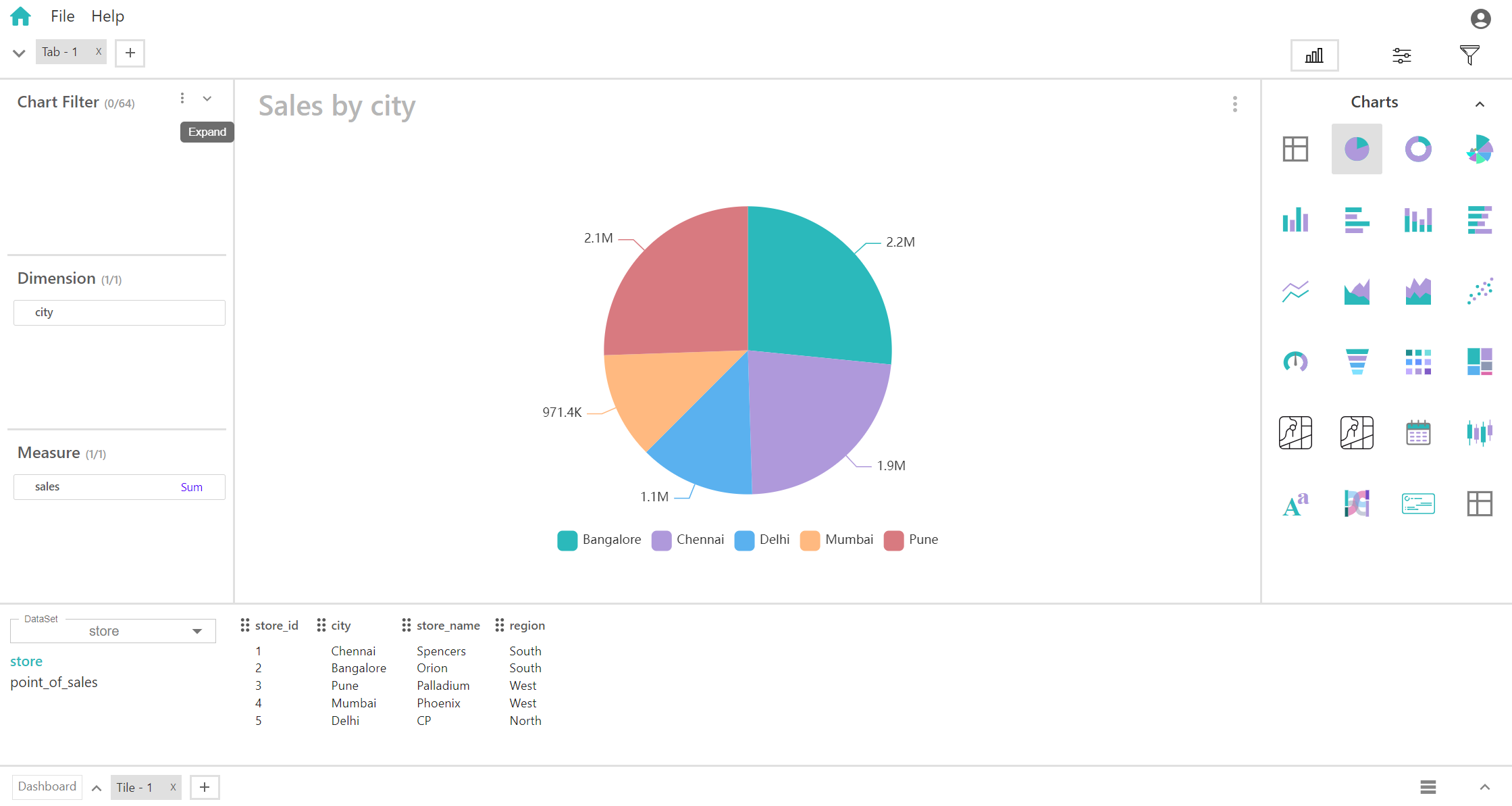
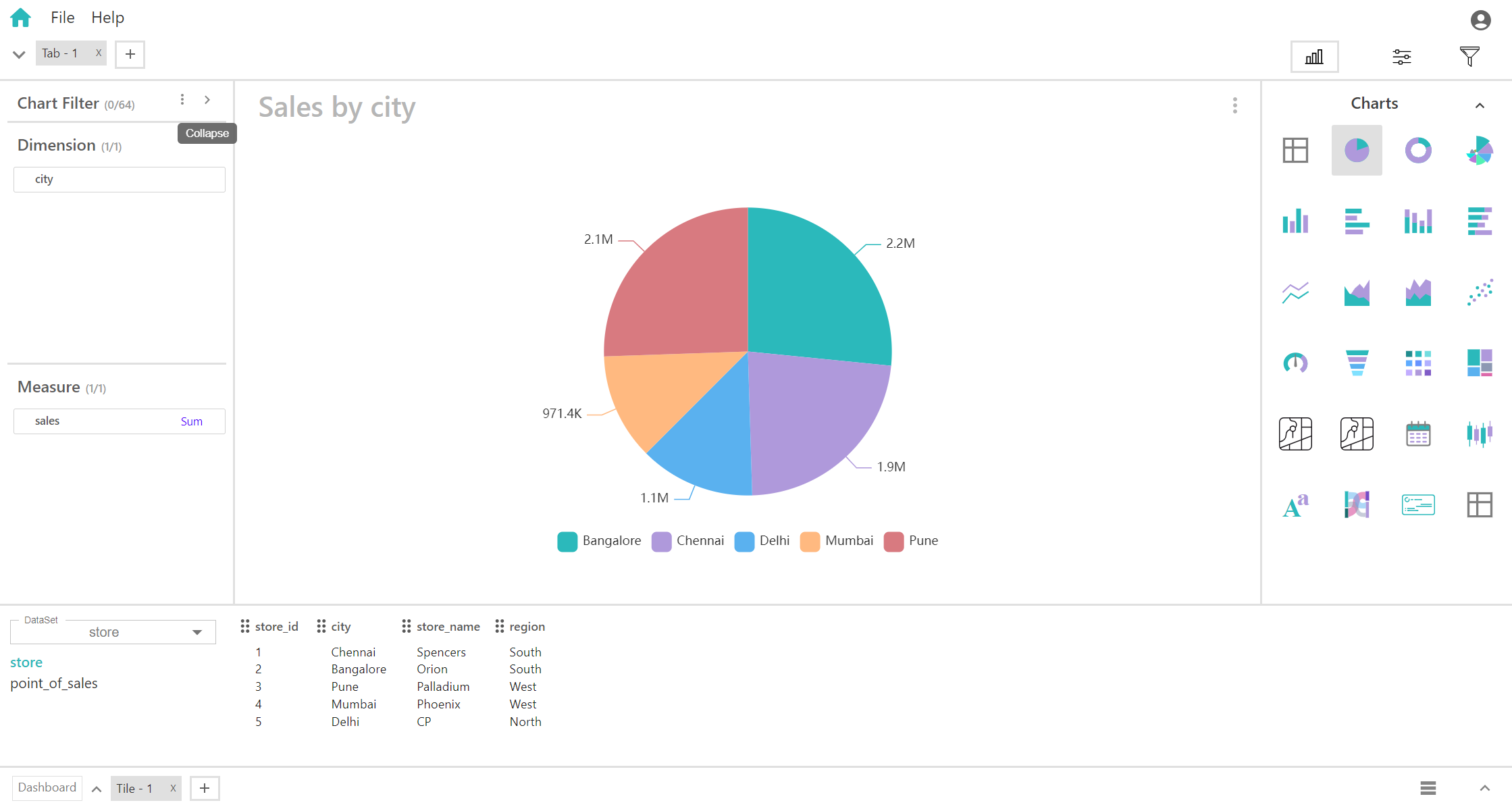
By clicking the following icon in chart filter, you can “Expand” and “Collapse” the chart filter window.
Expand Image
Collapse Image
Field Options In Chart Filter
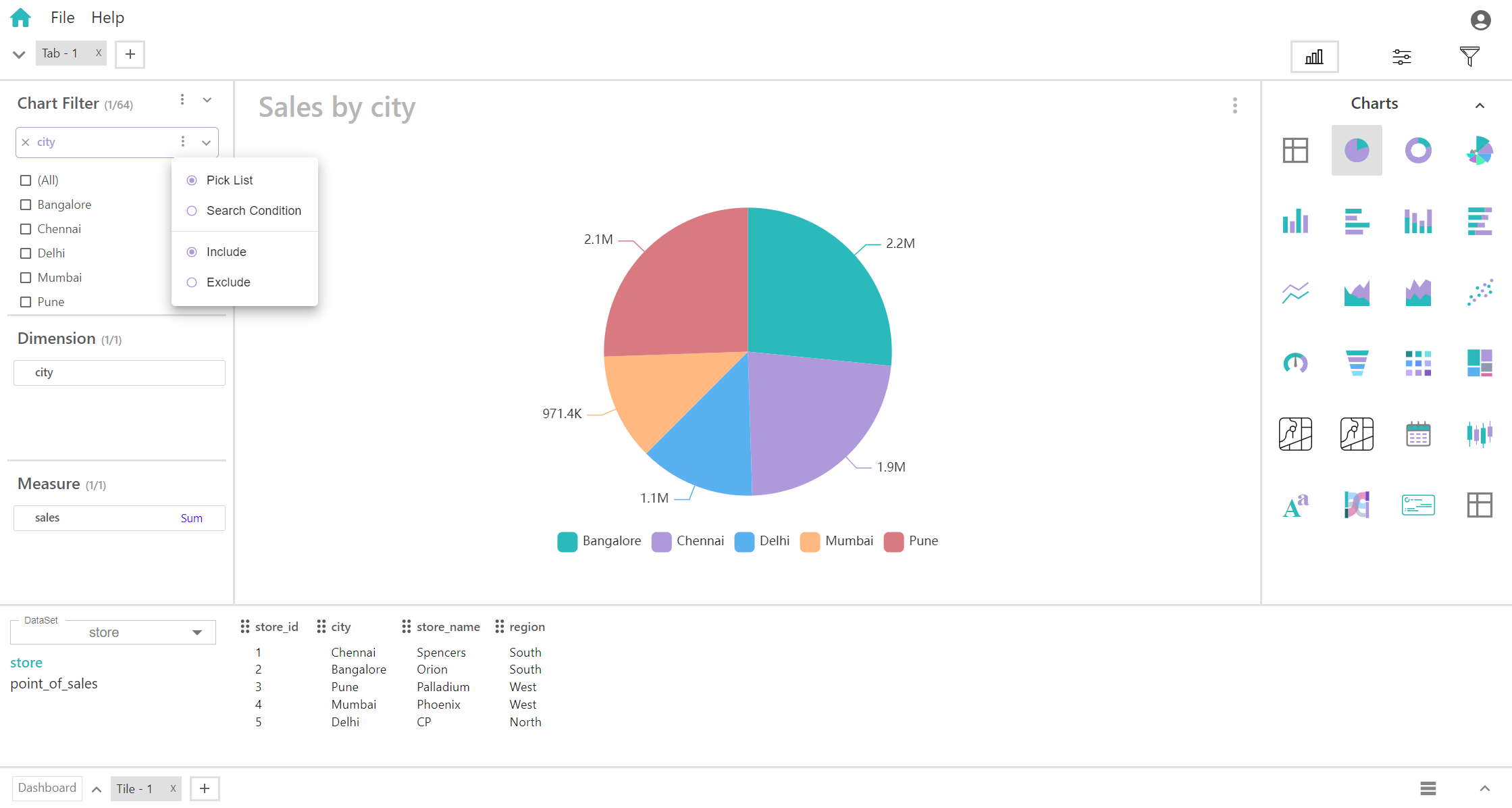
By clicking this icon in each field, you will get the following options:
- Include
- Exclude
- Pick List
- Search Condition
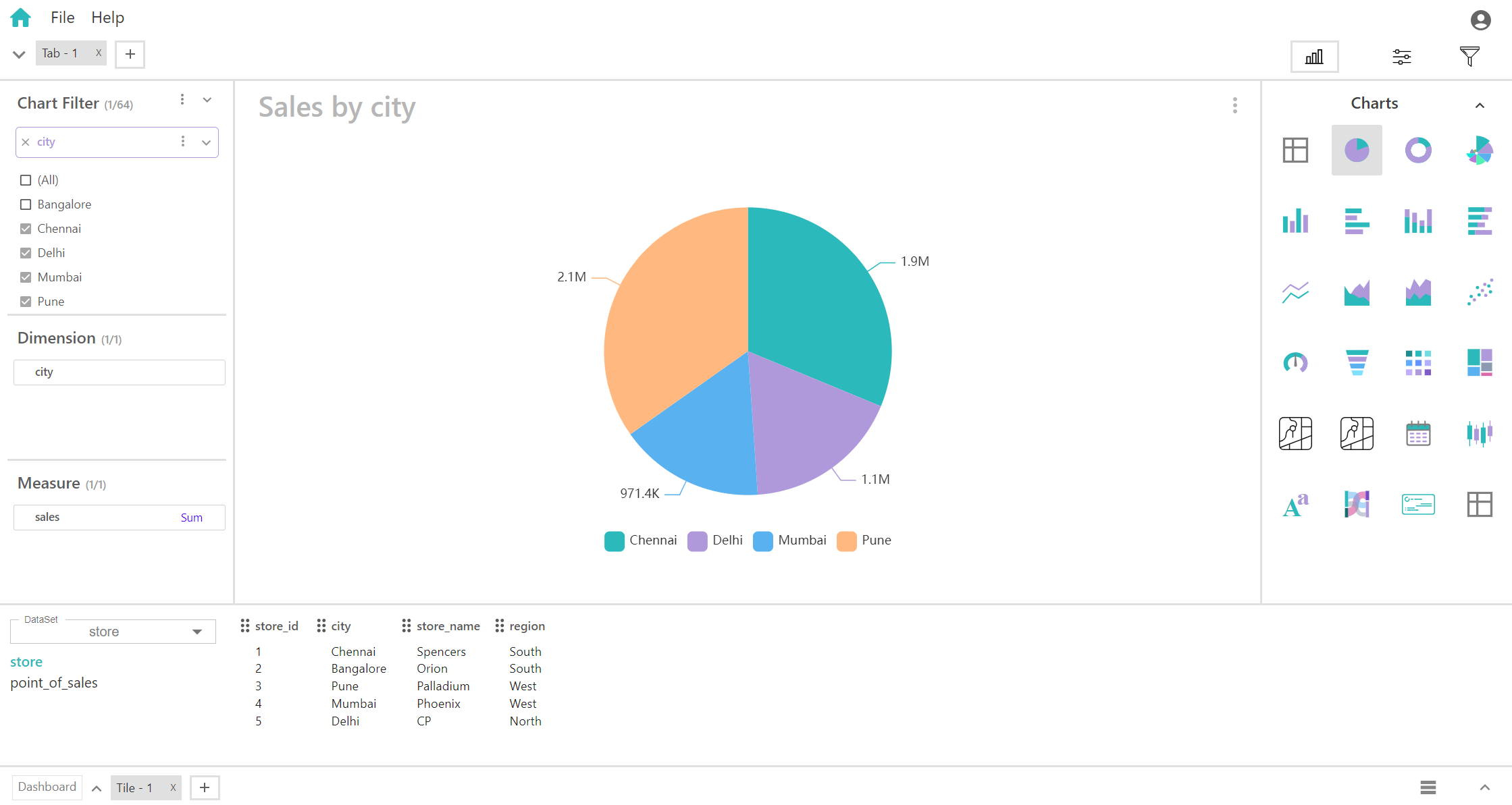
Include
In chart filters, 'include' selects specified data points or categories for display, narrowing the focus of analysis.
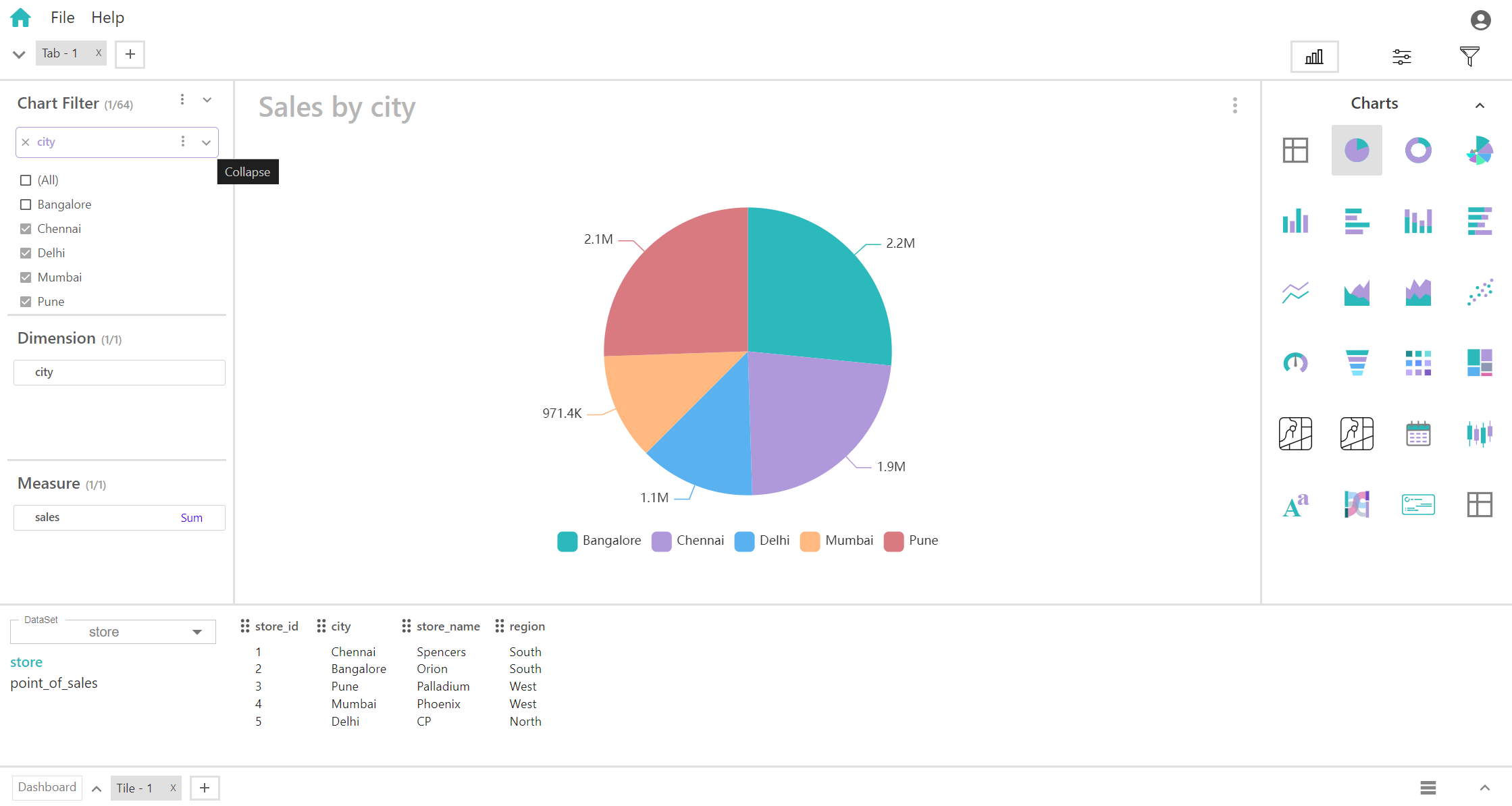
Here, displaying only included or checked cities,
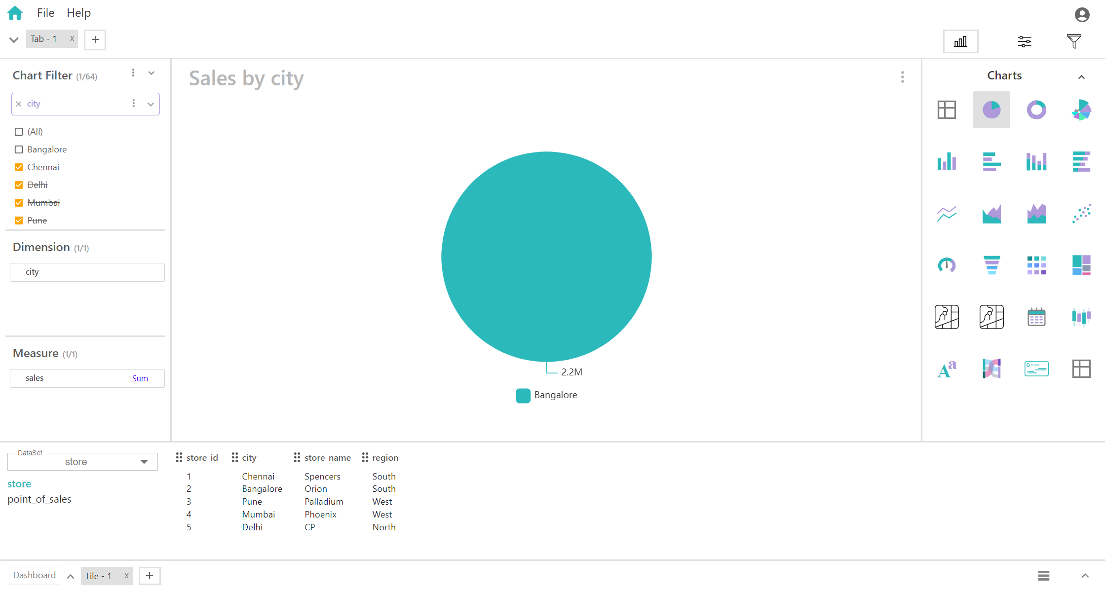
Exclude
Using 'exclude' in chart filters removes specified data points or categories from the visualization, refining analysis by omitting specific elements.
Here, omitting checked cities,
Pick List
"Pick list" in chart filters allows users to select specific data points or categories from a list for inclusion in the visualization, providing tailored insights based on chosen criteria.
Search Condition
"Search condition" in chart filters enables users to find and include specific data points or categories by searching for keywords or conditions, streamlining data selection for analysis.
Expand and Collapse of Chart Filter Field’s
By Clicking following icon in Field’s, you can “Expand” and “Collapse” the Field’s.
Expand
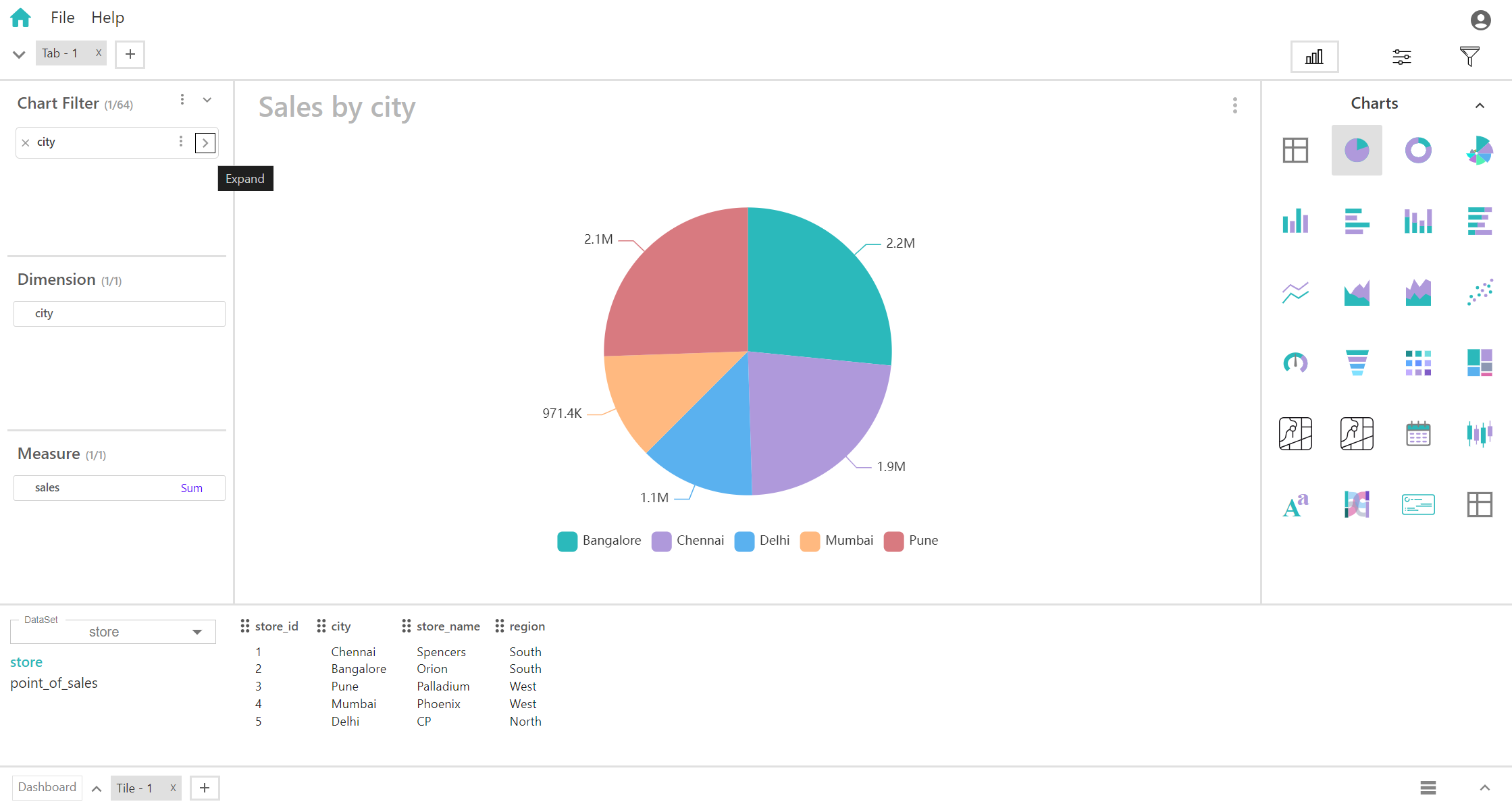
Collapse
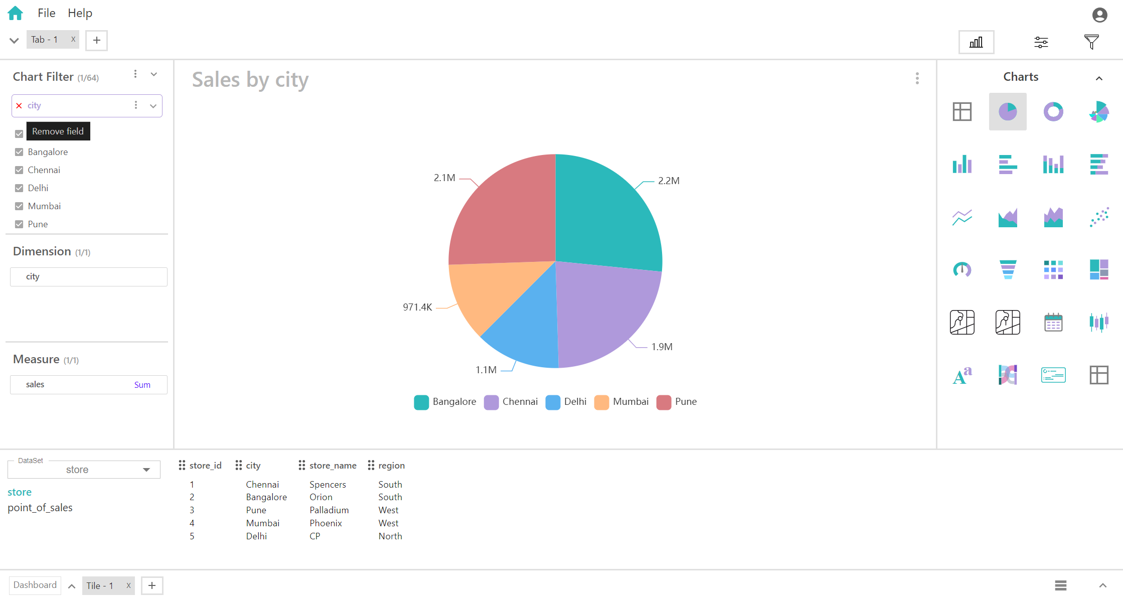
Remove Field’s in Chart Filter
"Remove field" within chart filters eliminates a chosen data field from the visualization, refining the chart by excluding specific data elements. This action streamlines analysis and directs focus towards key insights.
