Release Notes
Version 2.0
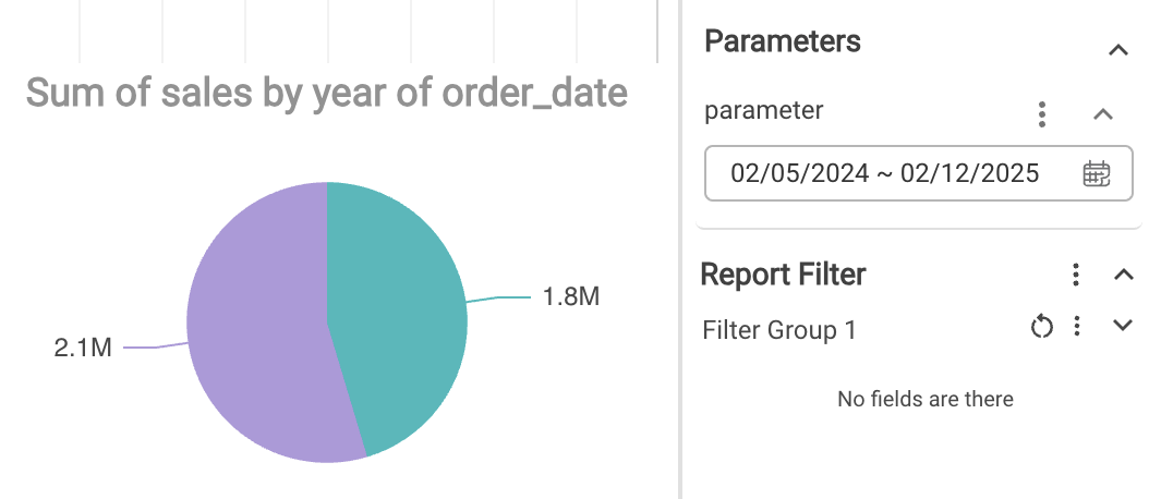
Parameters
Parameters are user custom inputs which can be directly plugged into formula builder and chart filters.
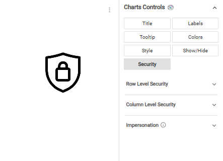
Row & Column level Security
Based on logged in user, the report can show only certain rows (dimensions) and some columns (measures) the user has access to.
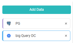
Federated query
Users can combine multiple data sources like Excel data with a database table and visualize it in Silzila.
Single Sign-On (SSO)
Single Sign-On is available for personal version. Users can sign-in using Google and GitHub login.

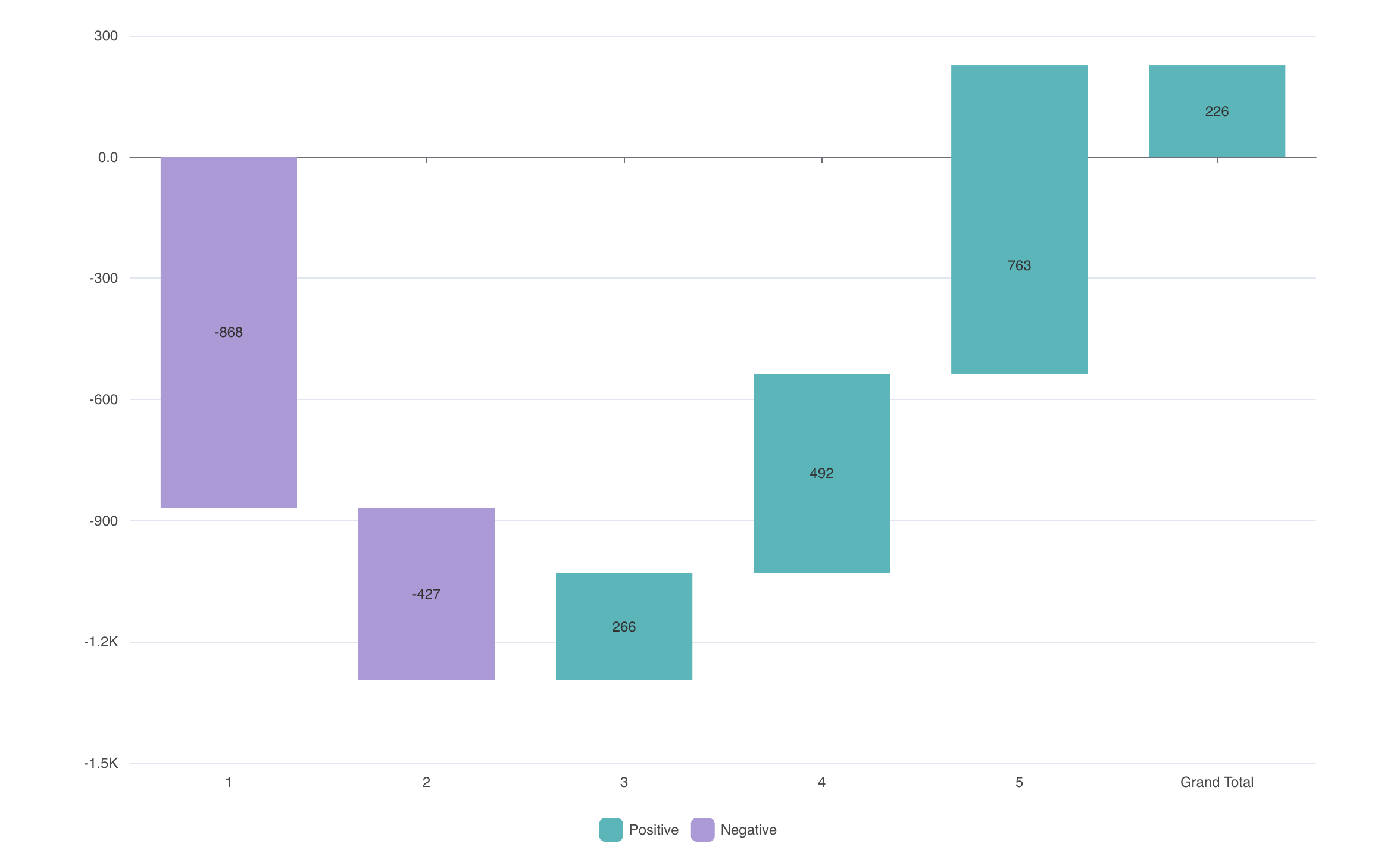
Waterfall chart
Bars are shown in a hanging way to understand the cumulative effect of contribution.
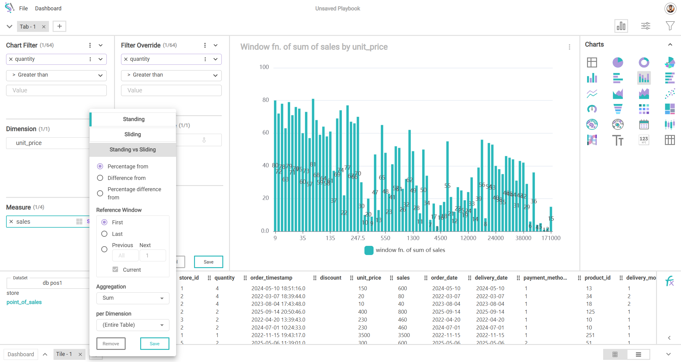
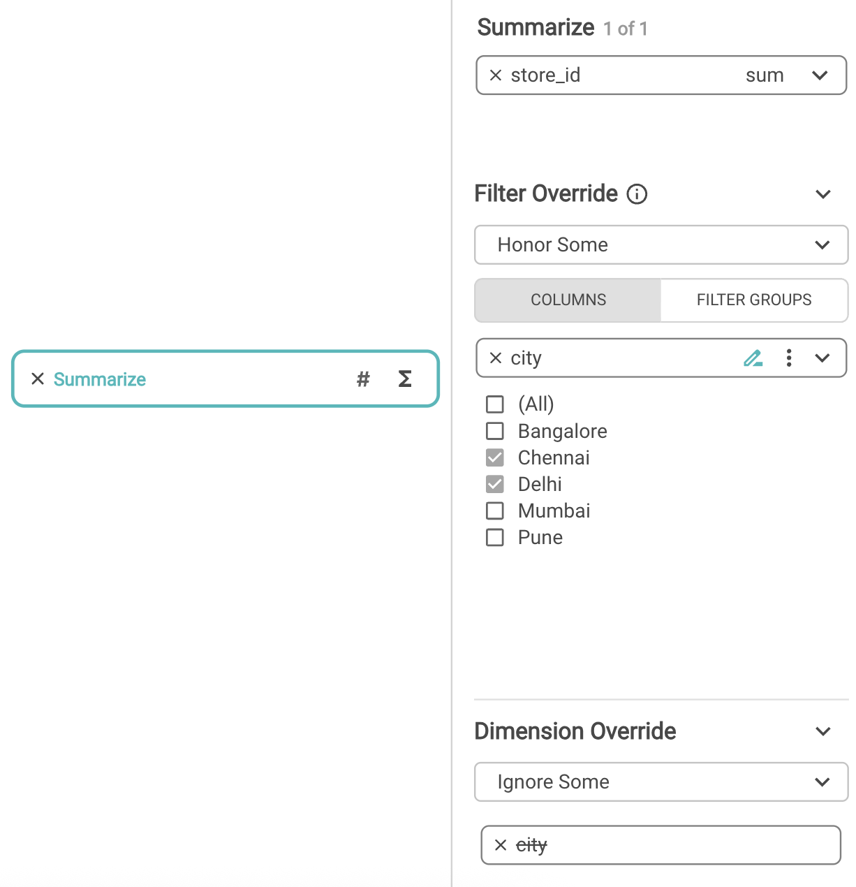
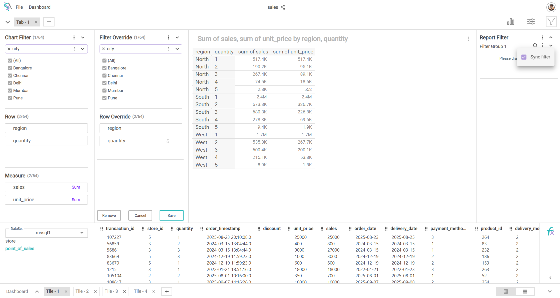
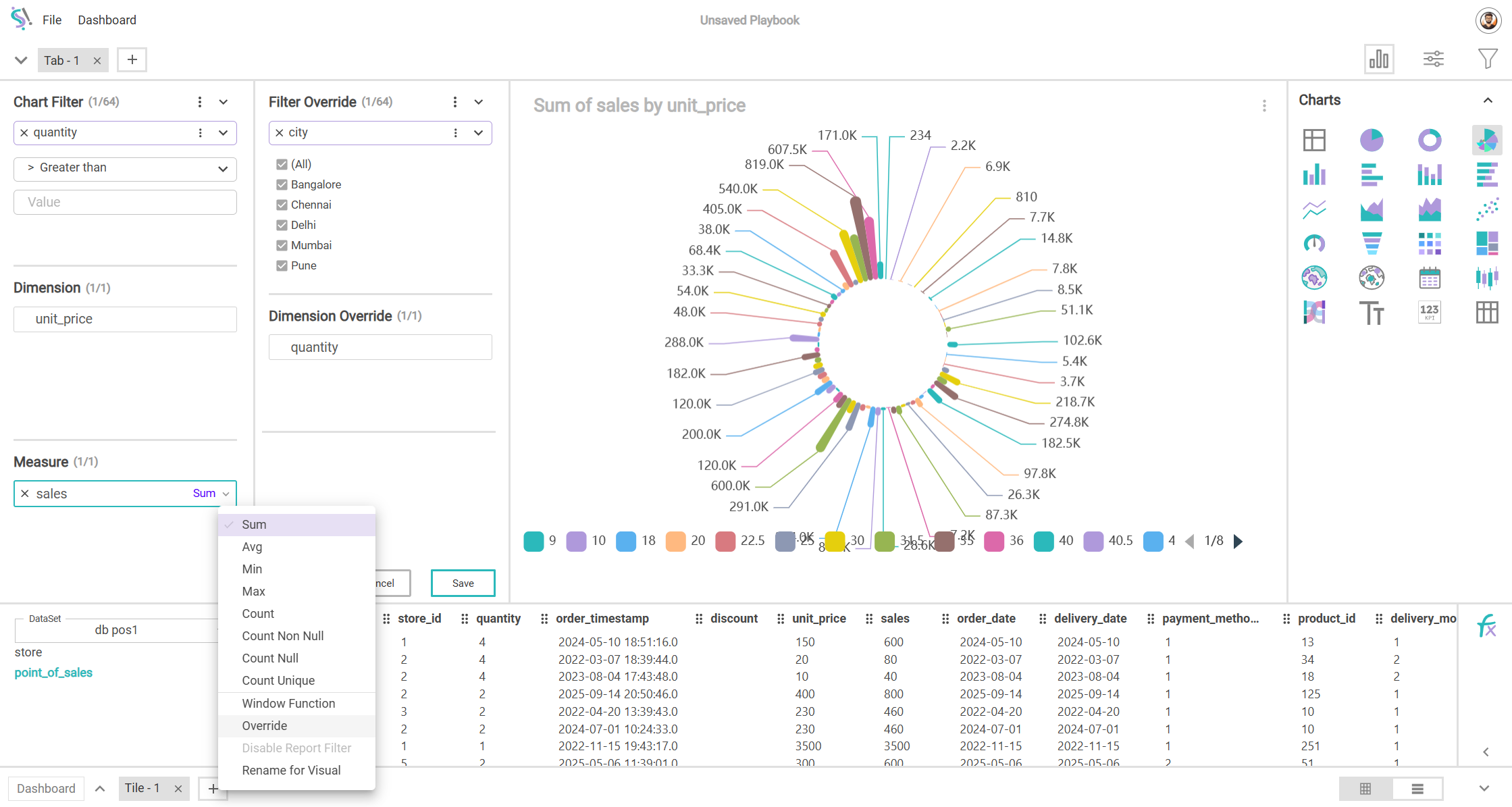
Override in Formula Builder
Override feature is available inside formula builder as well and users can create complex measure with different set of filters/dimensions.
MariaDB Support
This is a fork of MySQL and is one of the most used database. Users will be able to connect to MariaDB and explore data.

TV Display Dashboard
We can set data refresh intervals even when dashboard is open. This is helpful for reports opened in TV displays which gets auto data updates.
Buttons and Images
Users can add buttons and images in dashbaords. Buttons can be attached with events like navigation and opening a URL.

Mouseover interactivity
When user mouse over a chart, the same dimension value gets highlighted in other charts in the dashboard.
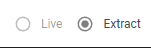
Data Extract
When live query is slow to load, extracts can help increasing the loading time of reports by the way of caching data.
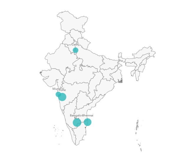
Mapping Cities
Now, cities can be mapped in worldmap and in all available country maps.
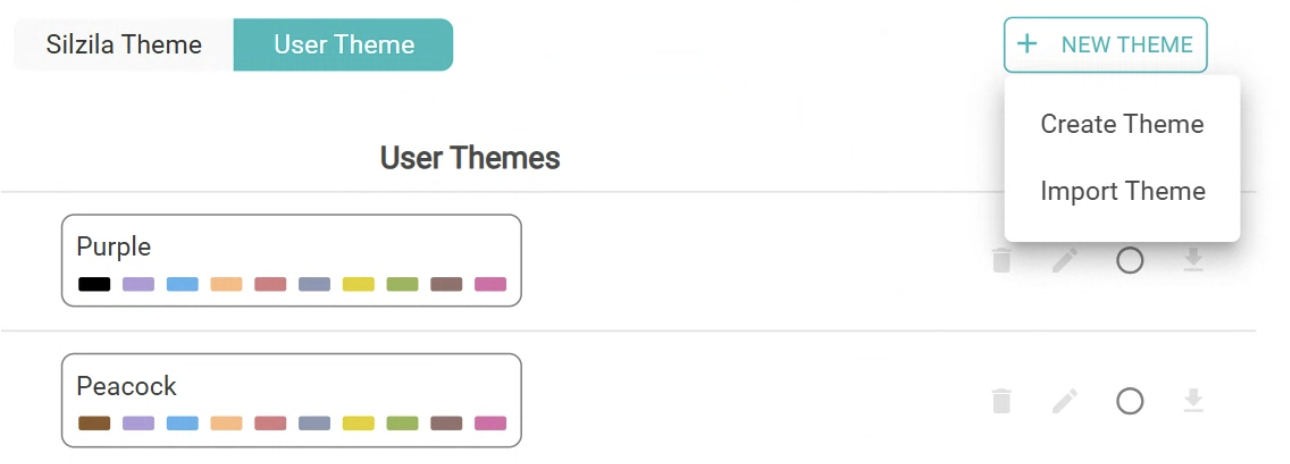
Import/Export Theme
If you have a custom colour palatte, you can share it to others through import/export functionality.
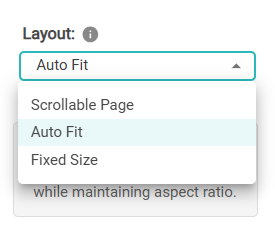
Dashboard Page Layout
Users can choose layouts/aspect ratios like auto fit, scrollable page, HD, Full HD and have custom size also.
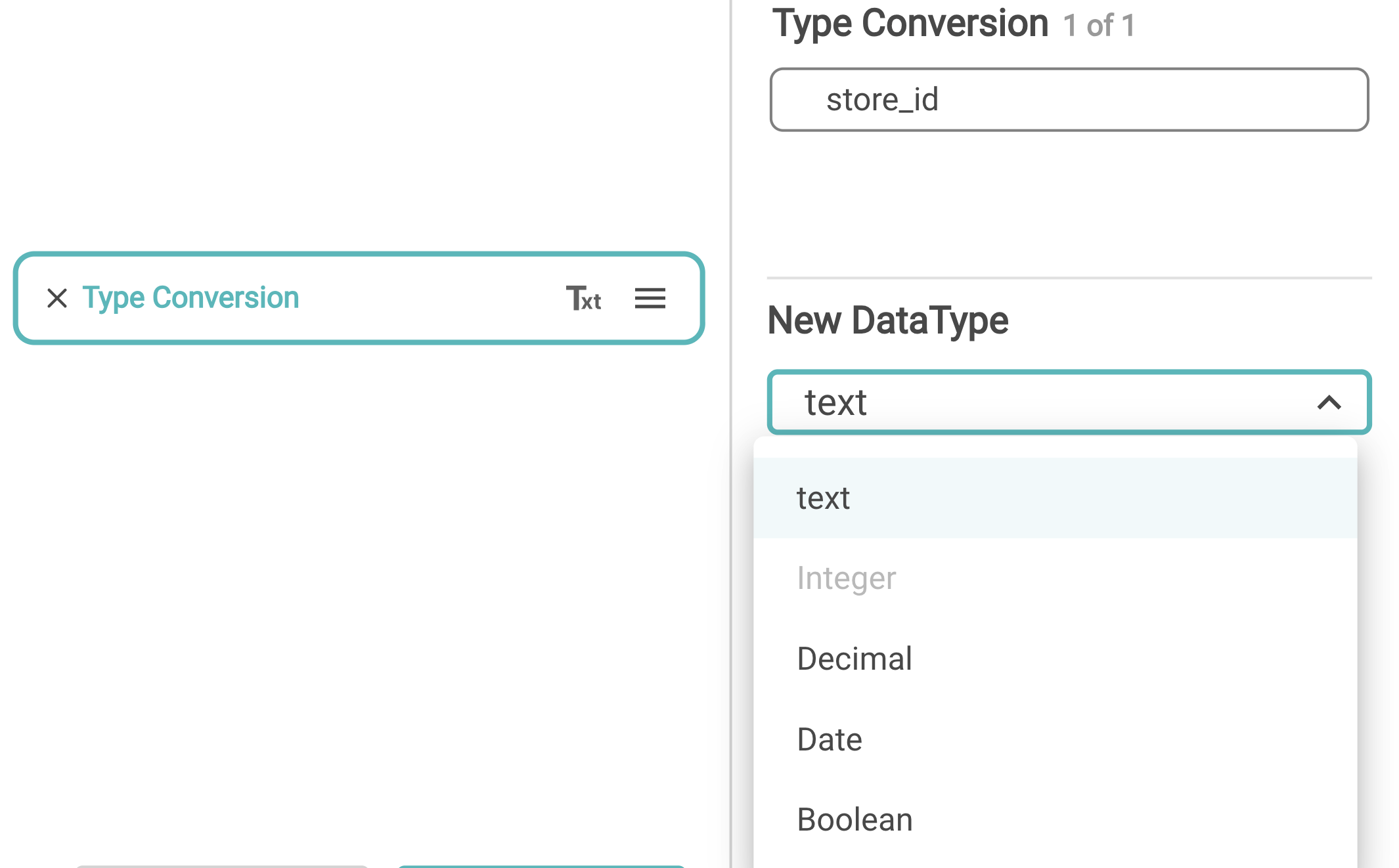
More functions in Formula builder
Datatype conversion, String concatenation functions are to be added.
Version 1.1
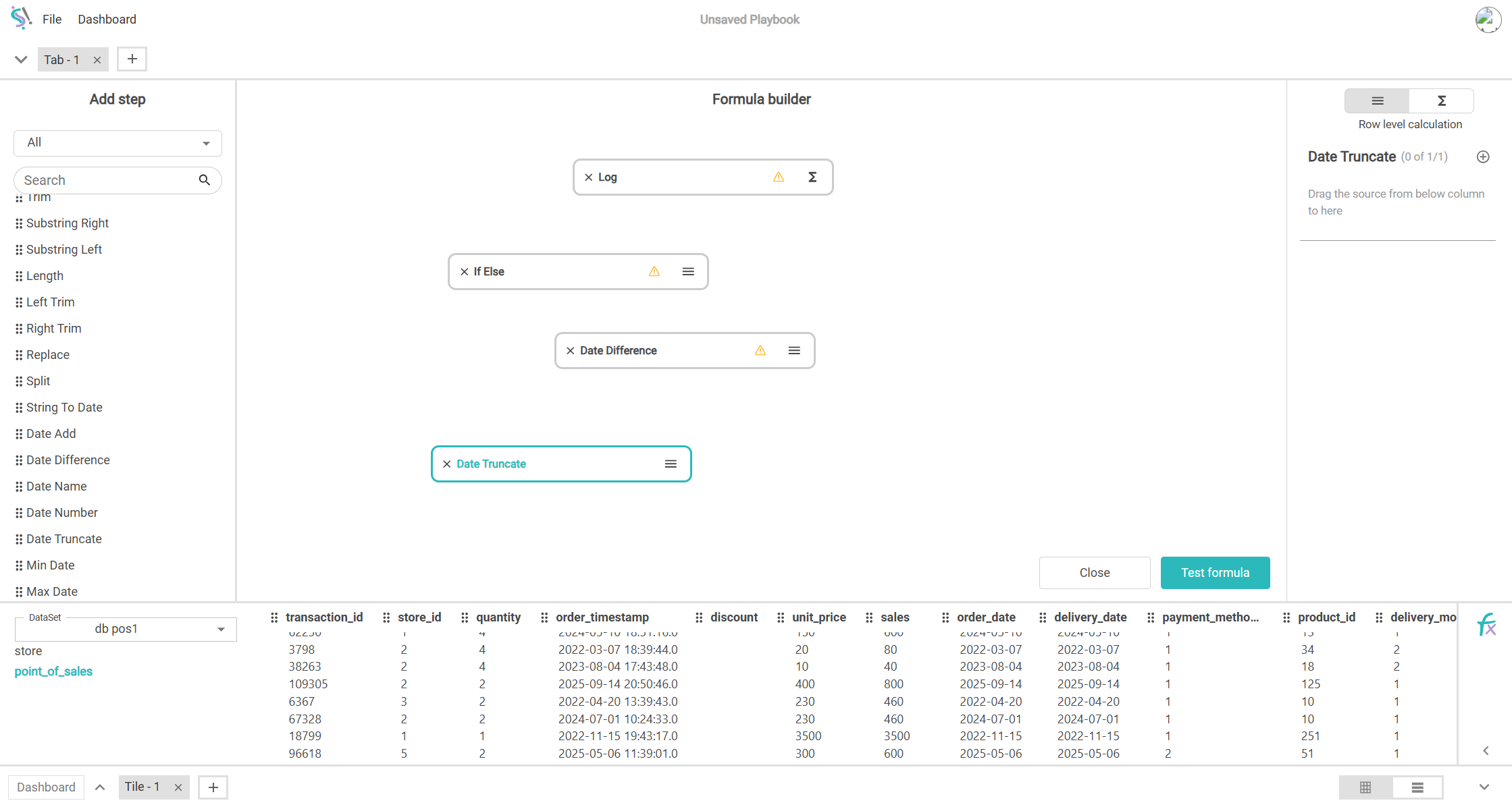
Multi-flow Formula builder
Users can chain multiple flows in the drag-and-drop formula builder so that it’s easy to create complex formulas.
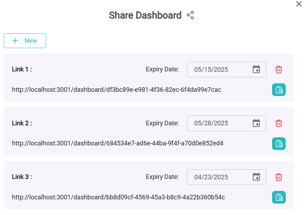
Sharable Link
In the personal version, users can generate multiple links for dashboards and share them with the world. Anyone with the link can open and interact with the dashboard.
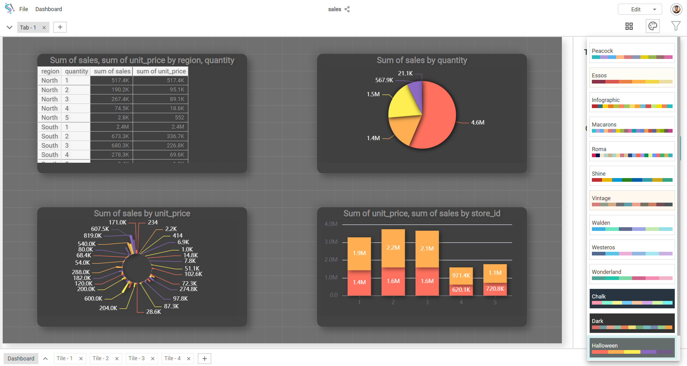
Themes
Many light and dark themes are added so that it’s even easier to style the entire dashboard based on your taste in one click.
Sync Filter
a.k.a. drill-through filter. Users can enable Sync Filter in Filter group where each selection affects the available options in other filters.
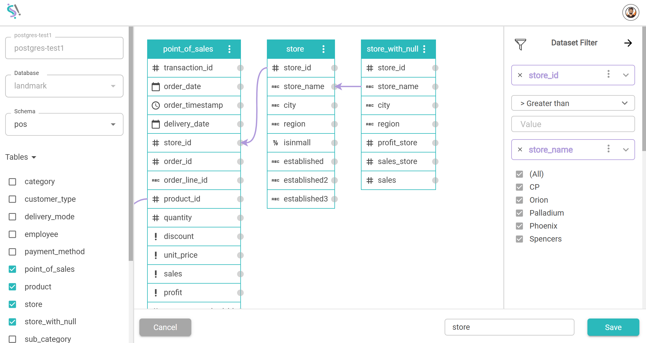
Dataset Filter
Drag-and-drop filter functionality is available at the dataset level itself. Users can perform complex filtering operations with ease.
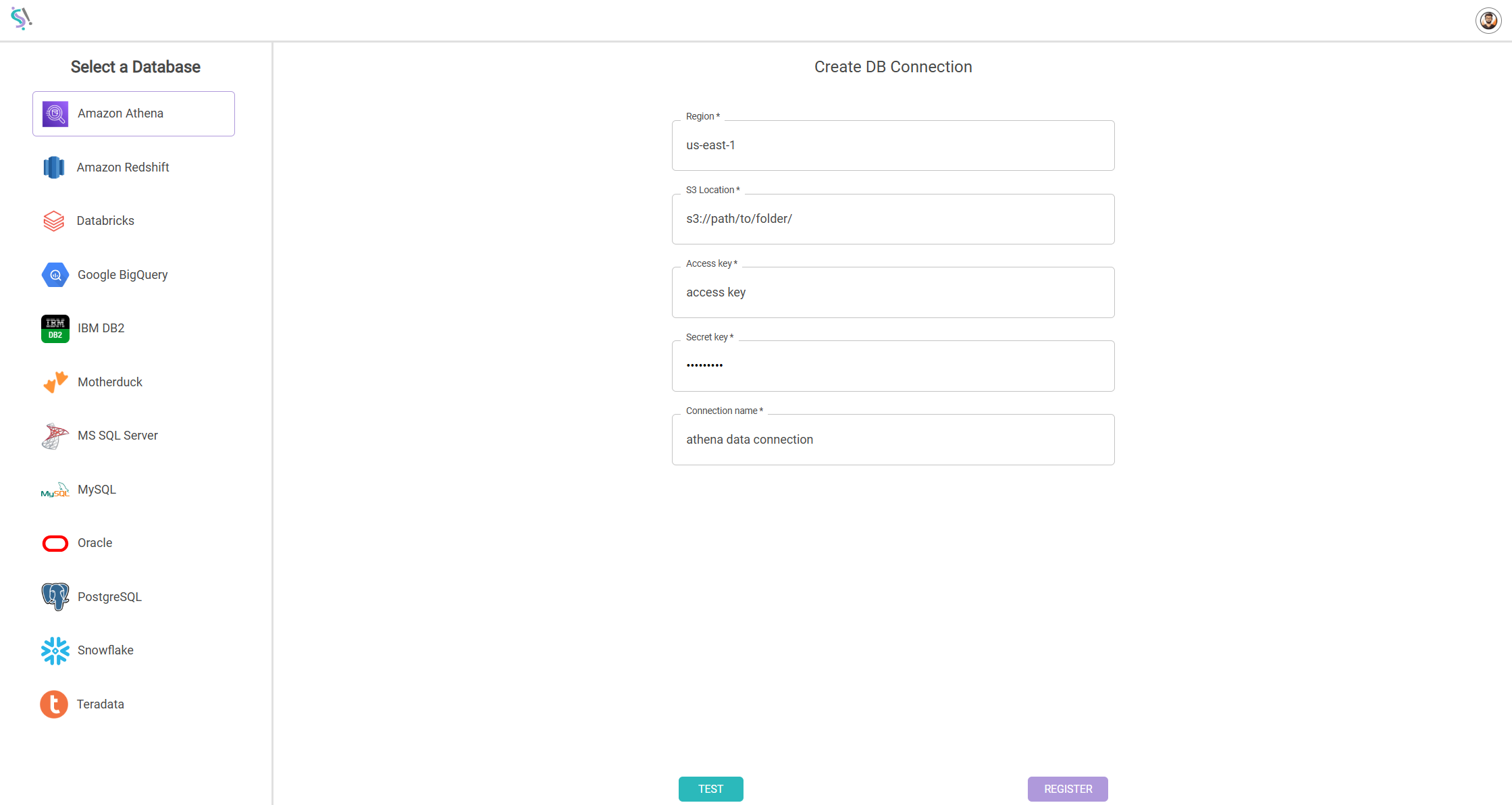
Amazon Athena Support
Added support for connecting to Amazon Athena datasource and explore data.
Export Chart data to Excel
From any visuals, we can export the data straight into Excel.
Version 1.0
KPI Card Visual
A metric can be represented very simply as a card with conditional formatting.
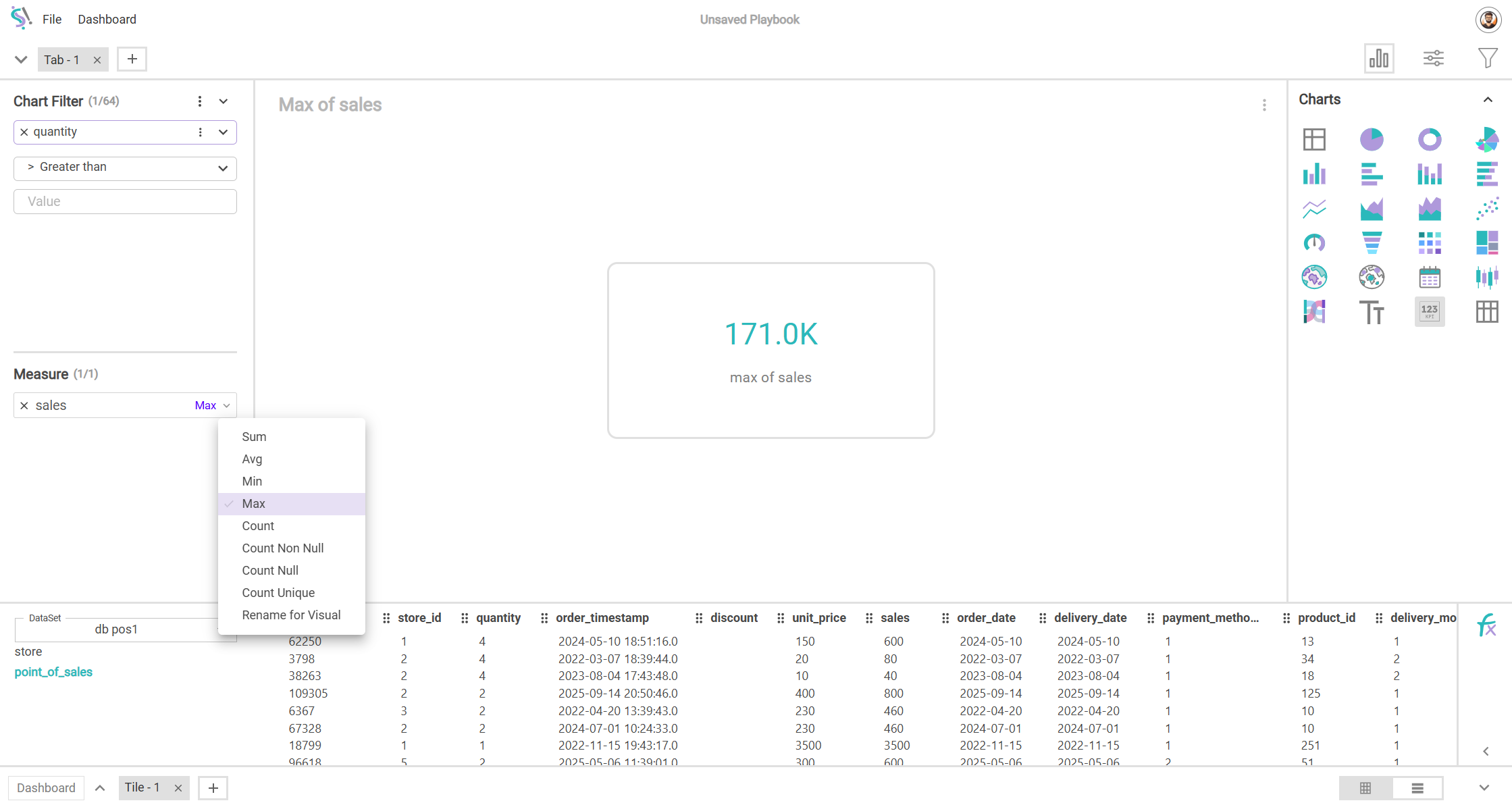
Measure Override
This drag-and-drop feature helps us in understanding each measure without the restriction of already existing filters and hierarchy of dimensions.
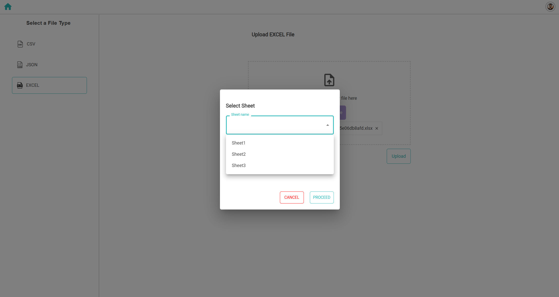
Excel import – Sheet selection
Previously, while uploading excel, we had to give the sheet name manually. Now, user can select the sheet name from a drop-down list.
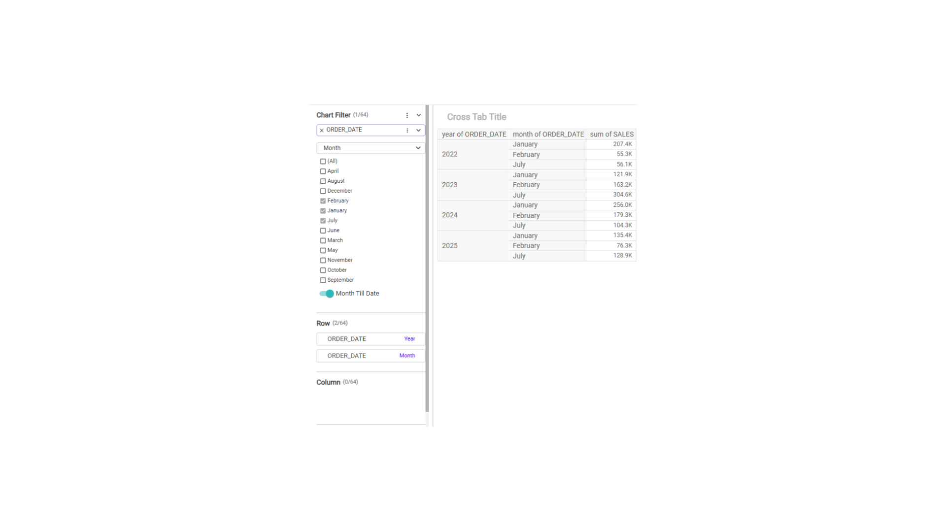
YTD MTD Filter
YTD switch is added in the date filter so that it’s easy to filter YTD, MTD, QTD & WTD with just one click.
Window Function
Window functions like Rank, Running Total, Moving Average, Difference From, Percentage of Total are just two clicks away for every measure.