 Signin
Playbook
Playbook is a workbook where we can connect to data set, explore data, interact data, create charts and present in a dashboard. We can share playbook without sharing the underlying data. We can selectively grant access to users or groups to the playbook.
Creating a Playbook for Data Exploration and Dashboard Creation
- Connect to Your Dataset: Start by importing your dataset. This can be either through a database connection or by uploading a flat file.
For detailed instructions on connecting to various data sources, refer to the Dataset. - Create a Playbook:
Once your dataset is prepared, navigate to the Playbooks section.
- Select Your Dataset:
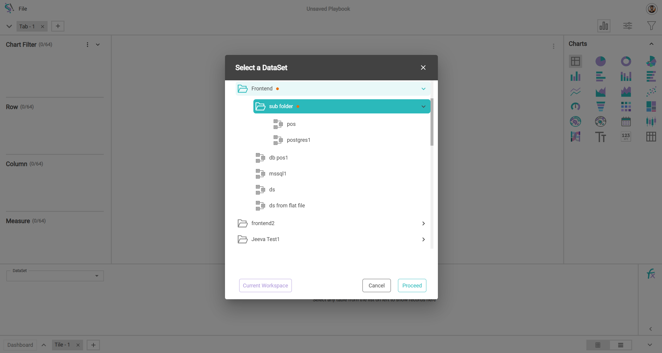
After navigating to the playbook, it will automatically open a rich tree view.In there the available datasets will be displayed. From the list of datasets, choose the one you wish to use for your playbook and click proceed to continue.
- Utilize the Playbook: With the dataset selected, you can now explore and analyze the data, and proceed to design and create your dashboard.
This process ensures that your data is effectively utilized in your dashboards and that you follow best practices for data exploration and visualization.
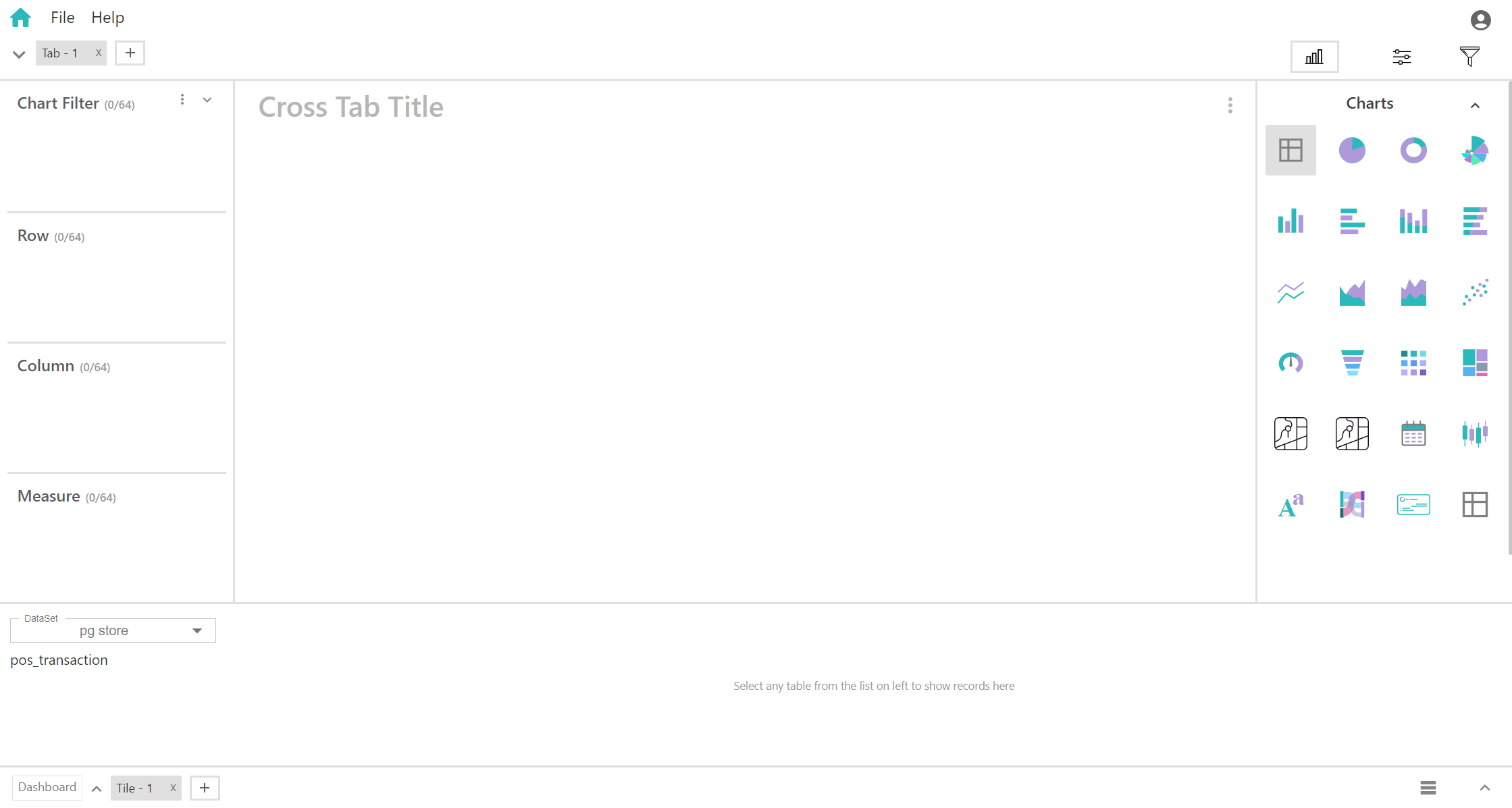
Playbook Workspace
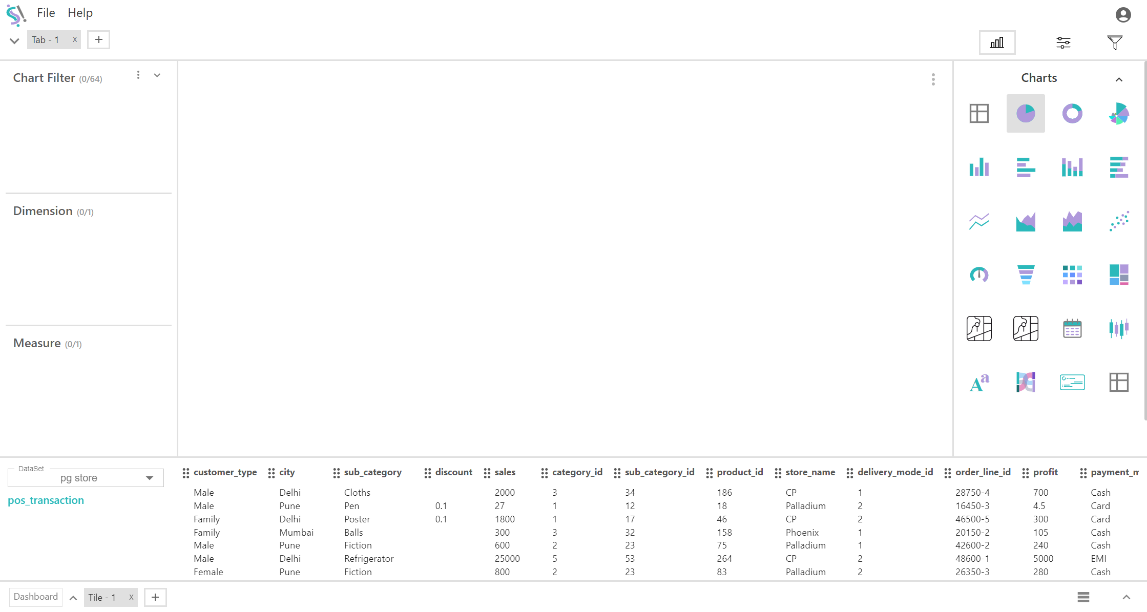
After entering the playbook, select the table you want to use for creating charts and dashboards. This option is located in the bottom left corner, below the dataset field.
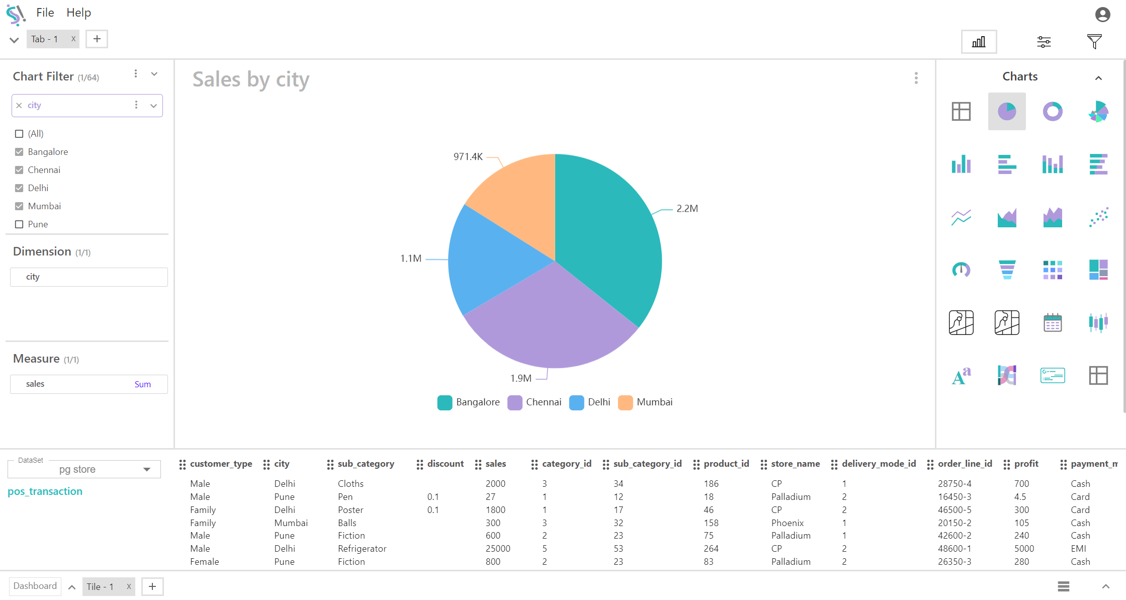
Once the records appear below the chart area, click the "Charts" icon in the top right corner to view all available chart types. By default, the chart options are displayed. Choose the chart type that best suits your needs.
Once the records appear below the chart area, click the "Charts" icon ![]() in the top right corner to view all available chart types. By default, the chart options are displayed. Choose the chart type that best suits your needs.
in the top right corner to view all available chart types. By default, the chart options are displayed. Choose the chart type that best suits your needs.
You can then drag and drop the records into the appropriate fields to configure the chart. Additionally, you have the option to add filters to refine your chart's data.
Playbook Features
- Tabs and Tiles
- Chart Filter
- Charts
- Chart Controls
- Report Filter
- Dashboard
1. Tabs and Tiles
Tabs and tiles are essential user interface components designed to enhance navigation and organization within a single interface. Tabs facilitate the switching between different views, sections, or pages, while tiles provide a grid-based layout for presenting multiple datasets or reports. Within the playbook, you can incorporate multiple tabs and tiles, each hosting various chart types. This functionality allows users to simultaneously interact with multiple charts using the same data records, streamlining data analysis and comparison.
2. Chart Filter
Filters are integral to modern data visualization, allowing users to interactively explore and analyze data to uncover meaningful insights. This section covers various filter types, including chart-level filters, filtering groups, and override filters. For detailed information on configuring and utilizing filters, please refer to the Chart Filter section for comprehensive guidance.
3. Charts
Silzila offers over 25 visualization types, each thoroughly detailed in this section. The coverage includes a list of available charts, the number of fields required for chart creation, and customization settings such as legends, labels, tooltips, and axes. For more information, please refer to the Charts section where you can explore the specifics of each visualization type.
4. Chart Controls
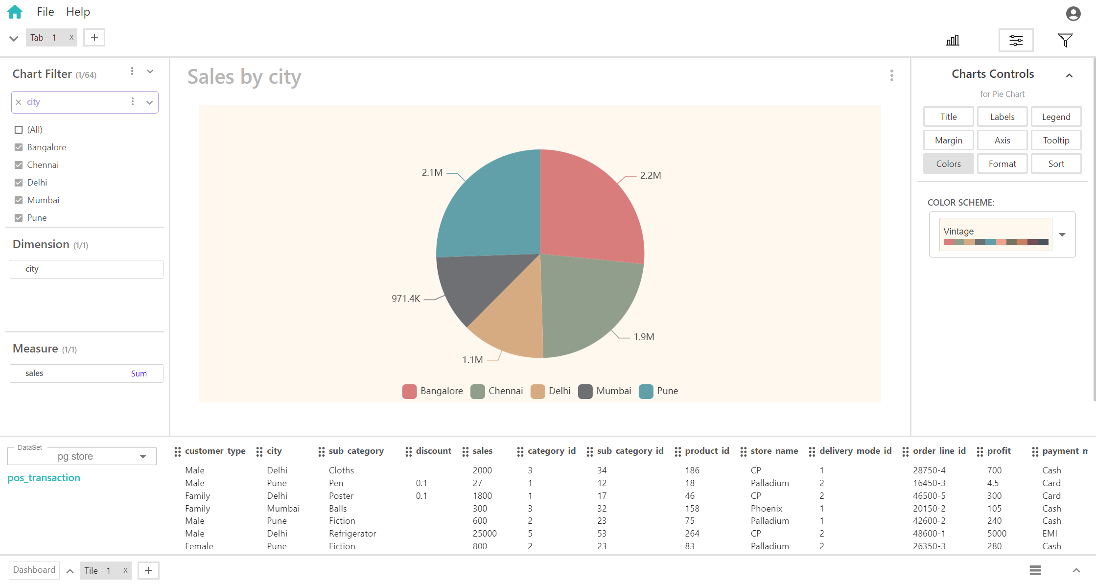
Chart controls are accessible near the chart icon in the top right corner after selecting a chart. These controls allow for extensive customization of each chart type. For instance, the pie chart features controls for title management, labels, legends, margins, axis settings, tooltips, color schemes, and sorting options. Each control has specific settings, such as title alignment (center or left), label visibility and positioning (inside or outside), padding adjustments, and label color customization. These options enable users to tailor charts to meet their specific needs and preferences.
For example, the Pie Chart in the data visualization tool includes various controls for detailed customization:
Title:
- Provides both auto and manual settings for title management.
- Align the title to the center or left.
- Enables adjustment of the title font size to fit design requirements.
Labels:
- Includes options to show or hide label controls.
- Lets users set label positions as either inside or outside the pie slices.
- Offers adjustments for label padding to improve readability.
- Allows modification of label size to enhance visual clarity.
- Provides manual settings for customizing label color.
Legend:
- Controls for displaying and positioning the legend on the chart.
- Choose between horizontal or vertical orientation for the legend.
Margin:
- Allows modification of the pie chart's radius to control its size and spacing from other chart elements.
Axis:
- Adjust the starting angle of the pie chart to rotate the chart and highlight specific segments.
- Toggle the clockwise rotation of the pie chart on or off to change the direction in which segments are ordered.
Tooltip:
- Toggle tooltips on or off to control whether they are displayed when hovering over chart segments.
Color:
- Choose from various color schemes to apply to different segments of the pie chart according to your preference. This allows for a tailored visual presentation that suits your taste and enhances the chart’s readability.
Format:
- Value Format:
- Display values as plain numbers.
- Format values as currency, including appropriate symbols.
- Show values as percentages.
- Label Format:
- Separator: (Choose how to separate numbers)
- No separator.
- Use commas to separate thousands.
- Use abbreviations for large numbers (e.g., K for thousand).
- Separator: (Choose how to separate numbers)
- Round Off:
- Adjust the rounding of values to the desired number of decimal places.
- Value Format:
Sort:
- Select the field or criteria by which to sort the pie chart segments.
- Sort segments in ascending order based on the selected criteria.
- Sort segments in descending order based on the selected criteria.
Example Chart Creation: Pie Chart
- Dimension and Measure Selection:
- "City" added as the dimension to represent different categories.
- "Sales" added as the measure, specifically using the sum of sales to quantify the data.
- Chart Control Customization:
- Use the chart control options to adjust the color scheme by selecting different colors for each segment.
- Chart Display:
- The pie chart will illustrate sales distribution across cities, with each segment’s size reflecting the sum of sales for that city. The color scheme applied will enhance visual differentiation between the segments.
5. Report Filter
The Report Filter feature allows you to manage group selections within a dashboard effectively. To set up a report filter:
- Create a Filter Group:
- Before applying filters to the dashboard, create a new filter group.
- Populate the chart filter with relevant data and set up the necessary filters in the chart filter field.
- Apply Report Filter:
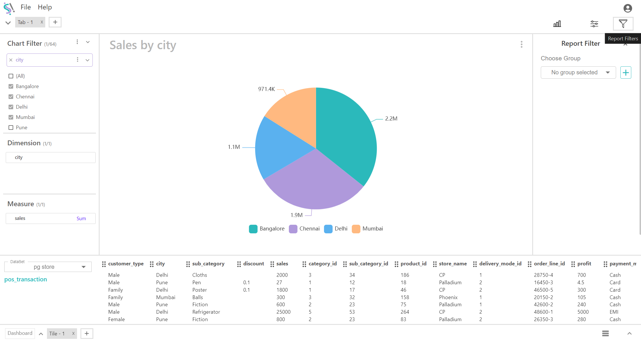
- Click the Report Filter icon located in the top-right corner.
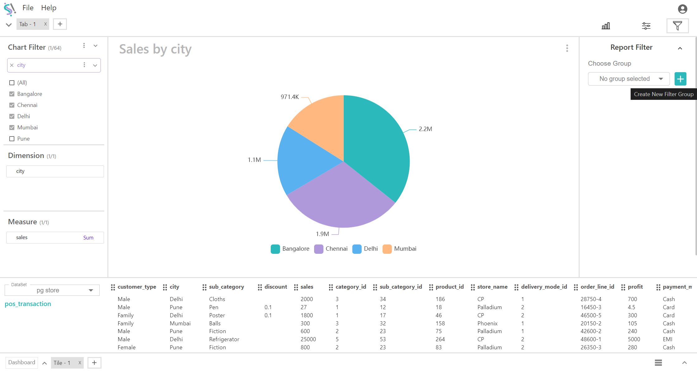
- The Report Filter interface will appear. Click the plus icon to add a new filter group.
- This action creates a Filter Group 1. Drag and drop the pre-configured chart filters into this group.
- You can create multiple filter groups for different tiles, which will be utilized later in the dashboard.
6. Dashboard
A dashboard in a data visualization tool offers an interactive, comprehensive visual display that aggregates key metrics, insights, and performance indicators into a unified view. Positioned in the bottom left corner of the interface, the dashboard serves as a central hub for monitoring and analyzing data. It enables users to access and interpret information quickly, facilitating informed decision-making through a consolidated data overview.
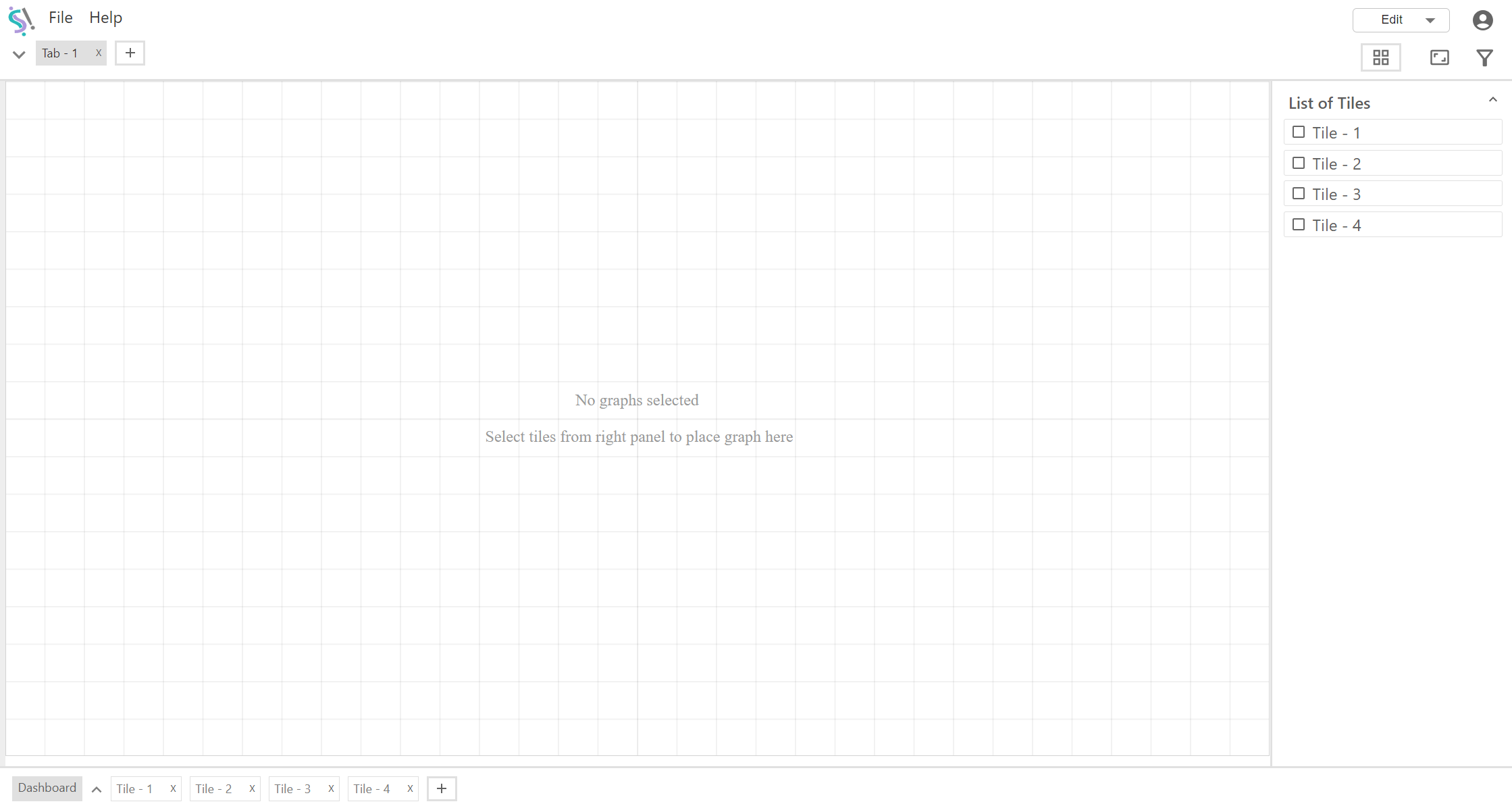
- Access the Dashboard: Click the Dashboard option located in the bottom-left corner to enter the dashboard view.
- Dashboard Options:
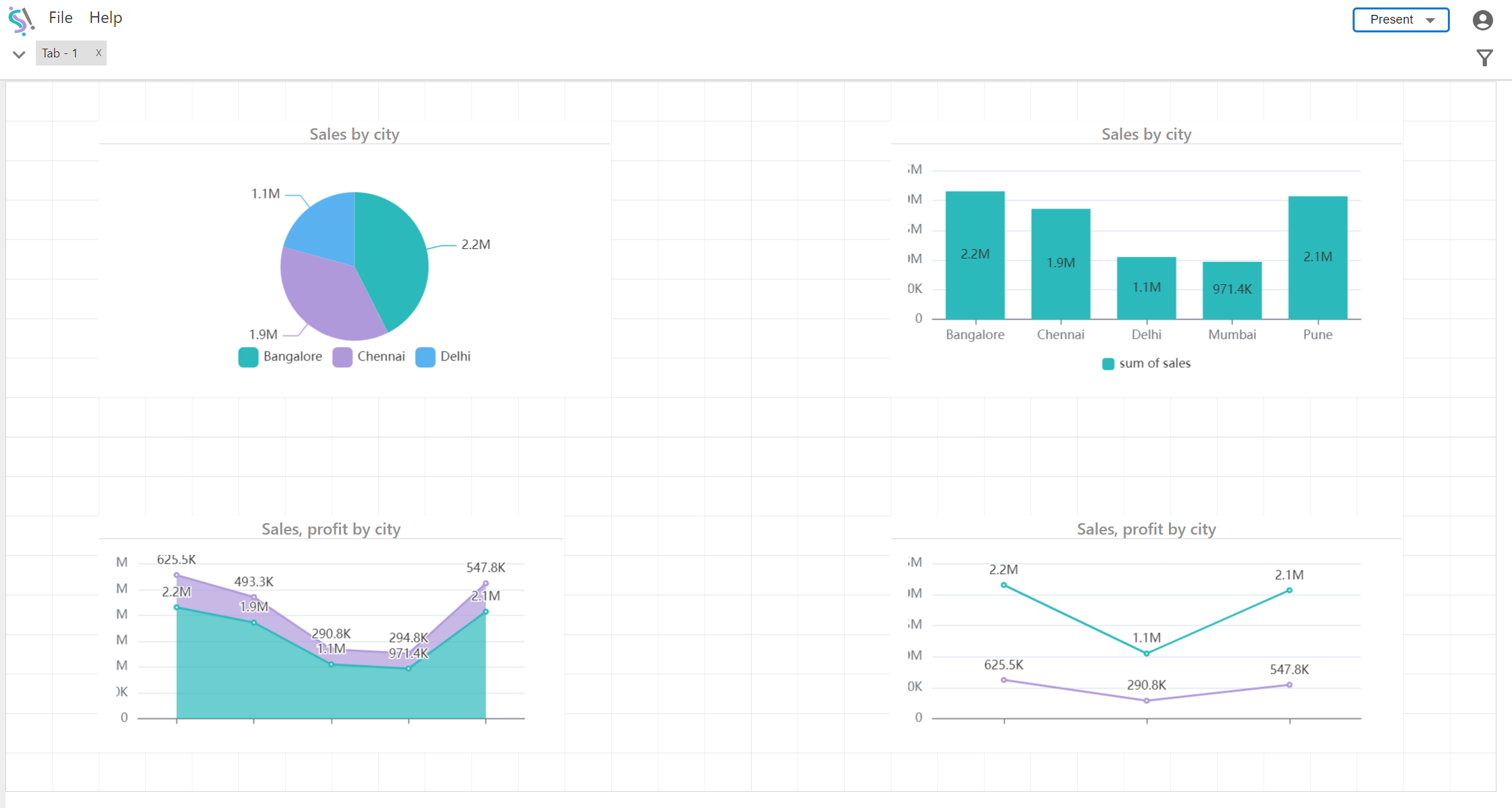
- Edit or Present Mode:
- Modify chart settings, such as adjusting the height and width, and enable or disable specific measure fields.
- Use this mode to present the charts to an audience.

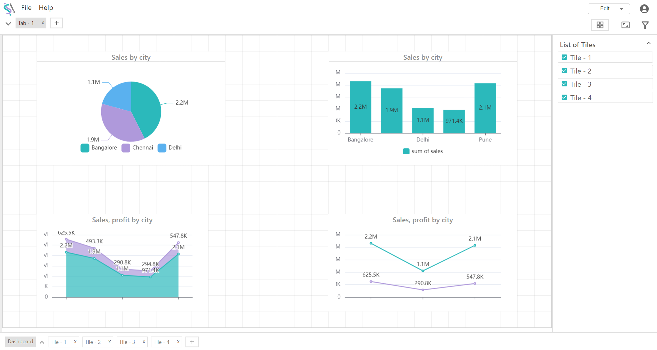
- List of Tiles:
- Displays all available tiles. You can select or deselect tiles to include or exclude them from the view.
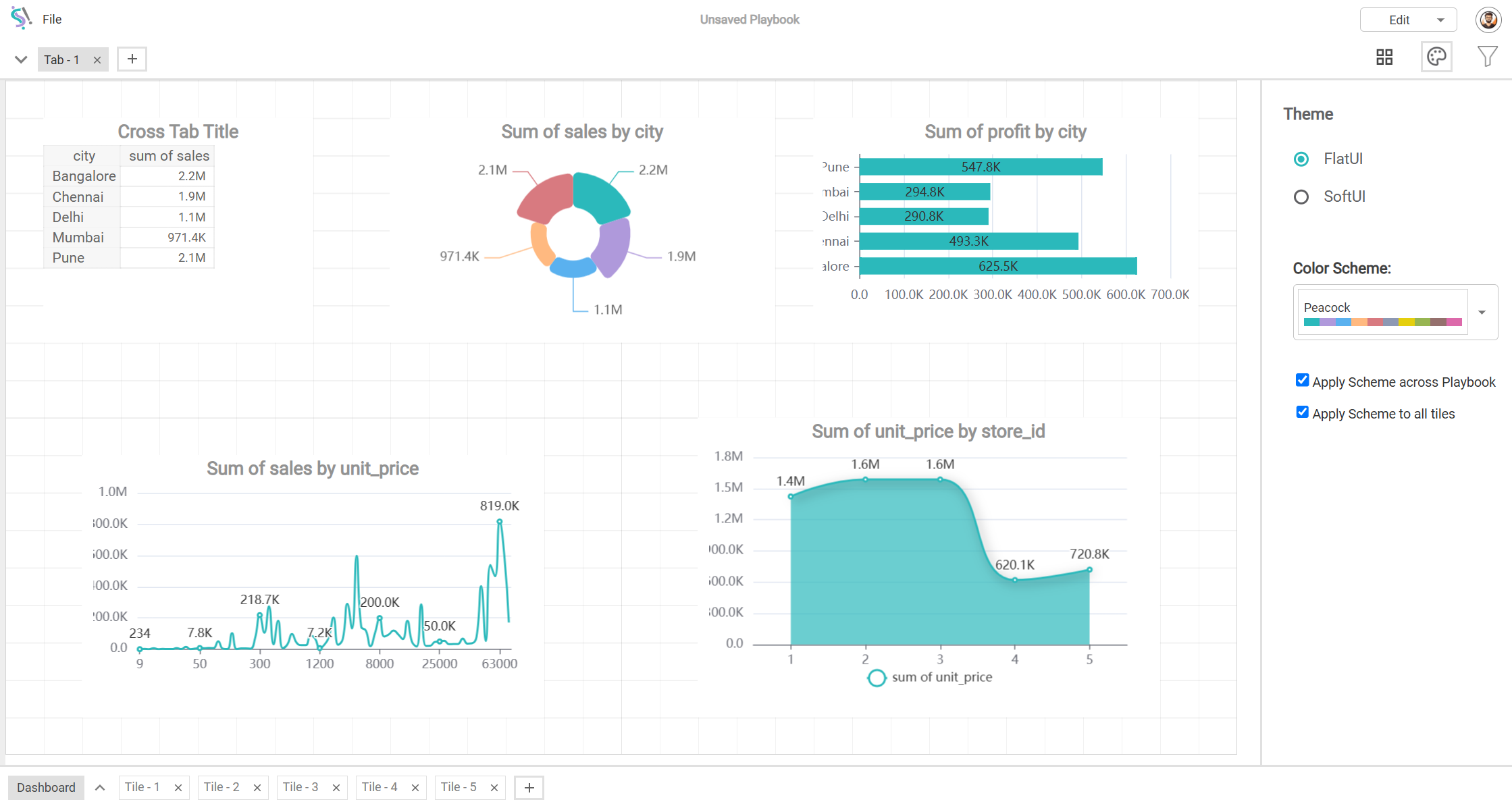
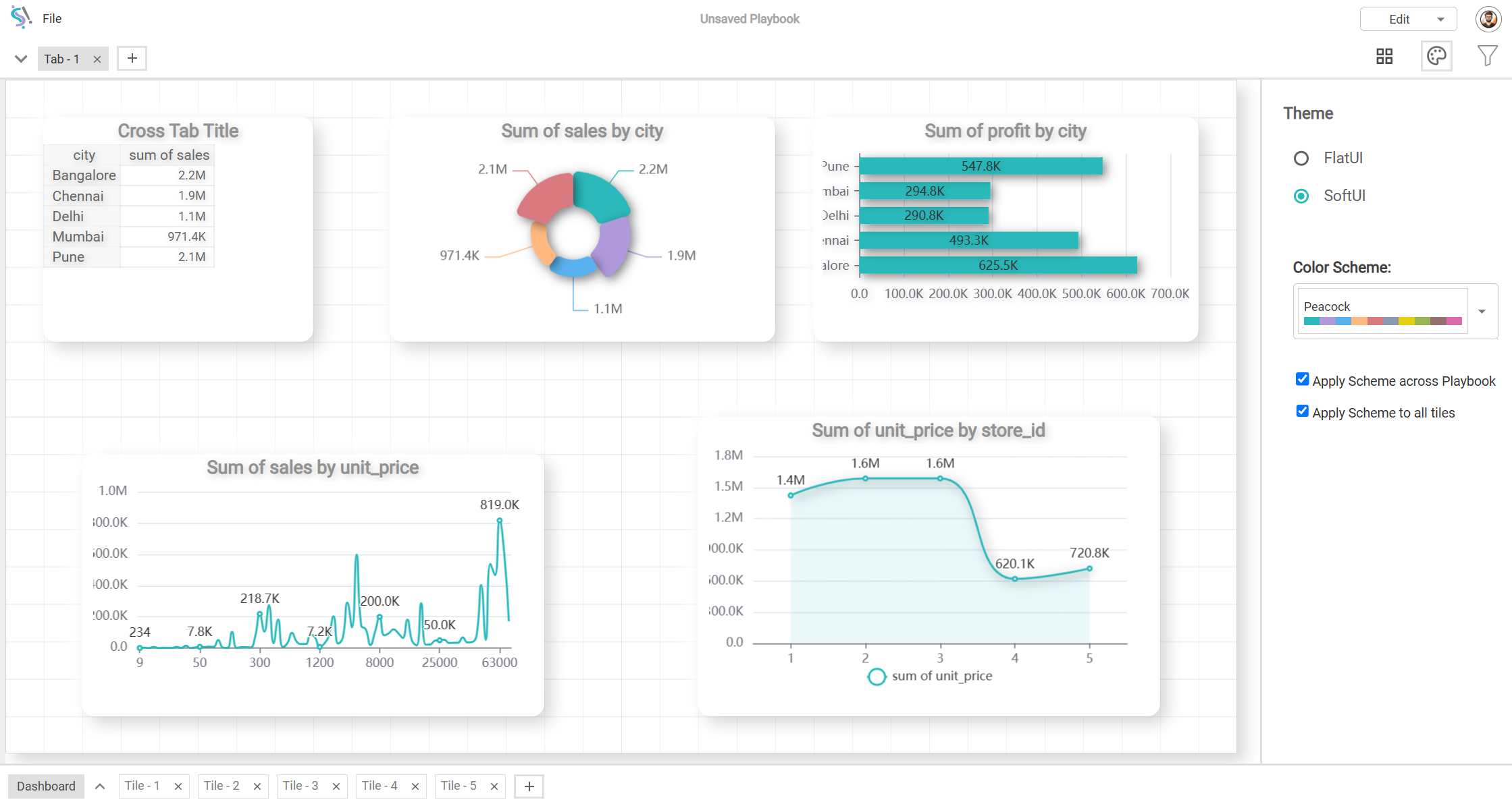
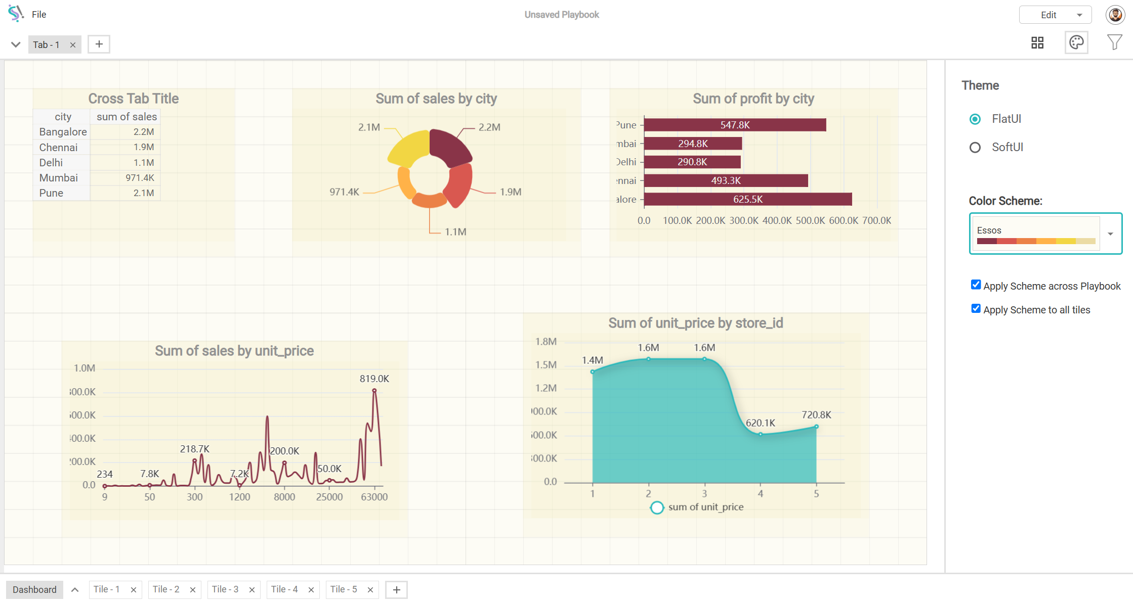
- Dashboard Theme:
- Flat UI is a design style that presents charts and dashboards in a simple, clean format without any visual enhancements like gradients or 3D effects.
- Soft UI is a design style that presents charts and dashboards in a 3D style with bold edges, distinct borders, and high contrast, emphasizing structure and clarity without soft shadows or blurred effects.
- There are multiple color schemes to choose from, and you can adjust them based on your project's needs.
- Dashboard Filter:
- Shows all filter groups created earlier. Use the drop-down arrow to add or remove filter groups.
- Each filter group has an options menu (three dots) next to its name. Clicking these dots will reveal all dashboard tiles associated with the selected filter group. For example:
- Includes Dashboard Tile 1.
- Includes Dashboard Tile 2.
- Edit or Present Mode:
By following these steps, you can effectively set up and manage filters, and customize your dashboard to suit your specific data visualization needs.
