 Signin


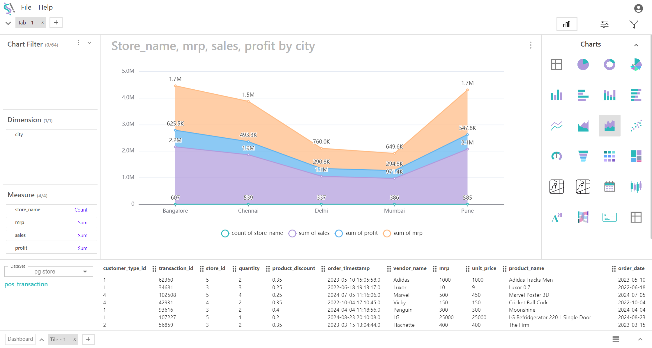
Stacked Area Chart
A stacked area chart is a variation of the area chart where multiple data series are stacked on top of each other. This type of chart is useful for showing how different measures contribute to the total over a single dimension. It helps in visualizing the cumulative effect of multiple measures and understanding their relative proportions over time or across categories.
Key Fields of a Stacked Area Chart
- Represents the single categorical or continuous variable plotted along the X-axis. Provides the context for the data, such as time periods or categories, allowing you to see how multiple measures stack up across this dimension.
- Categories such as time periods (e.g., months or years), cities, regions, or product types.
- Represents the numerical values plotted along the Y-axis. Each measure is stacked on top of the previous measure to show the cumulative value. Each measure's area is stacked on top of the previous one, making it easy to see the total value as well as the contribution of each measure. This allows for comparison of individual measures and understanding their cumulative effect.
- Metrics such as sales revenue, expenses, profit margins, and other numerical values. In this chart, up to four different measures can be represented, stacked to show their cumulative contribution.
You can display a maximum of One Dimension and Four measures in your chart/table.
When to Use a Stacked Area Chart:
- Ideal for showing the cumulative total of multiple measures over a single dimension, and how each measure contributes to the total.
- Useful for comparing the relative sizes and contributions of multiple measures over time or across categories. It helps in understanding how each measure varies in relation to others and how they contribute to the overall trend.
- Best suited for visualizing how the composition of measures changes over time or across categories, highlighting the changes in the total as well as the contributions of each measure.