 Signin


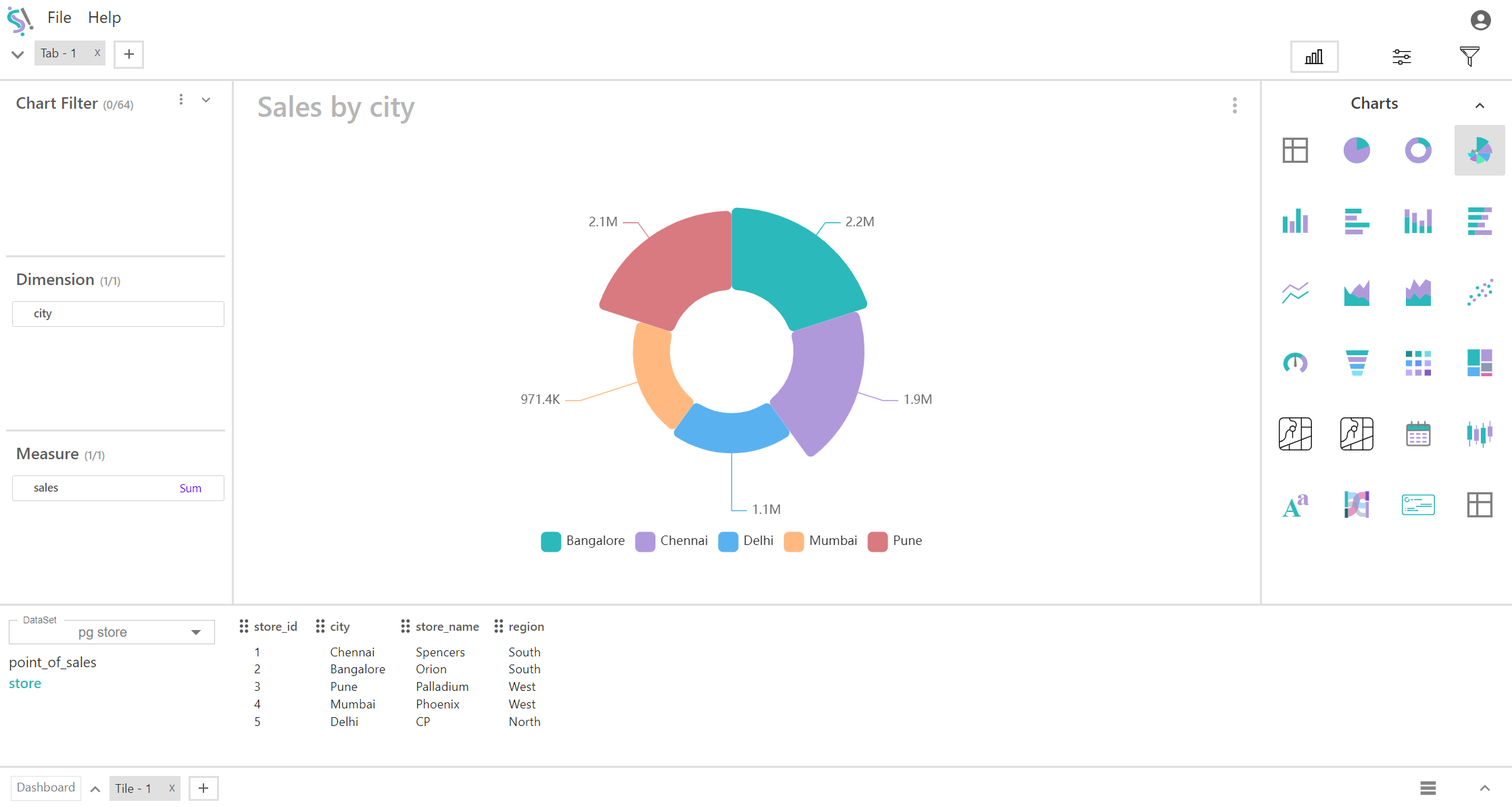
Rose Chart
A rose chart, also known as a polar area chart or coxcomb chart, is a type of circular graph that displays data in a radial layout. It is similar to a pie chart, but instead of dividing the circle into slices of varying angles, the slices (or sectors) have equal angles, and their size is determined by the radial distance from the center, which represents the value of the data point.
Key Fields of a Rose Chart
- The categorical variable that divides the chart into segments. Each segment corresponds to a category in the dimension.
- Geographical Dimensions: Country, state, city.
- The numerical value that determines the size of each segment’s radius. This value defines how far each segment extends from the center.
- Sales Figures: Total sales, sales revenue.
You can display a maximum of One Dimension and One measure in your chart/table.
When to Use a Rose Chart:
- Effective for comparing multiple categories simultaneously when each category is represented as a slice. This is useful for understanding how each category's measure (e.g., sales, profit) compares to others.
- Highlights differences in magnitude across categories by varying the radial distance. This allows you to easily see which categories have higher or lower values relative to each other.
- Particularly useful for data with a cyclical or periodic pattern, such as seasonal data. Each slice represents a time period or category, and the length of the radius reflects the measure for that period (e.g., monthly sales, hourly traffic).