 Signin


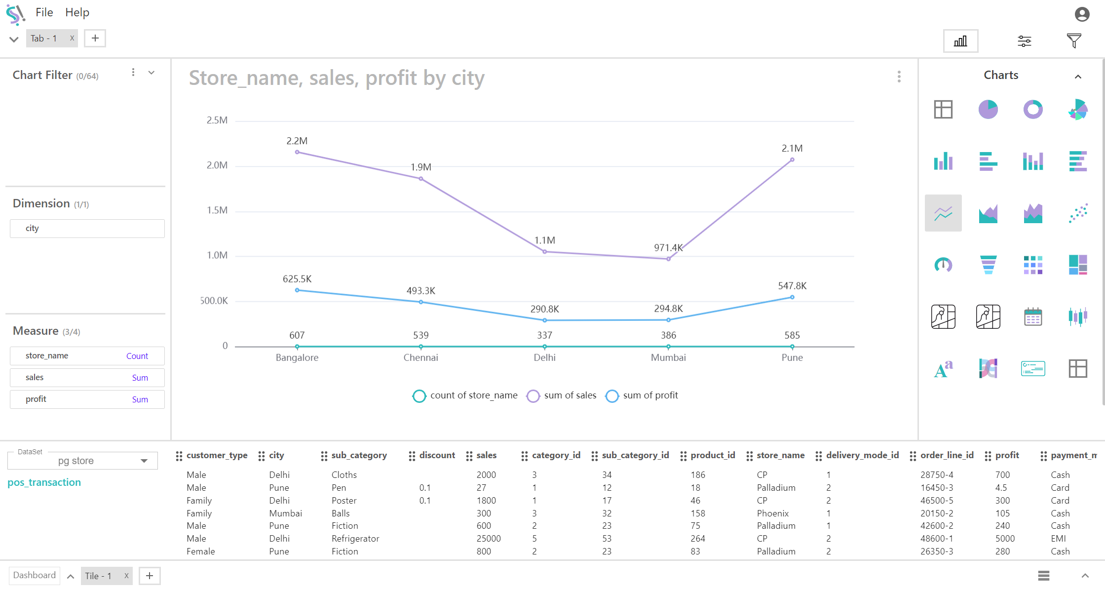
Line Chart
A line chart is a type of graph used to display data points connected by straight lines. It is particularly effective for visualizing trends over a single dimension and can plot multiple measures simultaneously. This type of chart is useful for comparing how different measures change over time or across categories.
Key Fields of a Line Chart
- Represents the single category or continuous variable that is plotted along the X-axis. Provides the context for the data, such as time periods or categories, enabling comparison of multiple measures over this dimension.
- Categories such as time periods (e.g., months or years), cities, regions, or product types.
- Represents the numerical values plotted along the Y-axis. Reflects different sets of data points that are plotted as individual lines. Each line represents a measure, allowing you to track and compare these measures across the dimension.
- Metrics such as sales revenue, temperature readings, or any other numerical values. In this case, up to four different measures can be plotted on the chart.
You can display a maximum of One Dimension and Four measures in your chart/table.
When to Use a Line Chart:
- Ideal for tracking changes and trends over time or across categories. It helps in identifying patterns and fluctuations in the data.
- Best suited for data that changes continuously, such as stock prices, temperature readings, or sales figures. Each measure is observed over the same dimension.
- Effective for comparing multiple measures simultaneously. This allows you to understand how different metrics interact or vary together over the same dimension.