 Signin


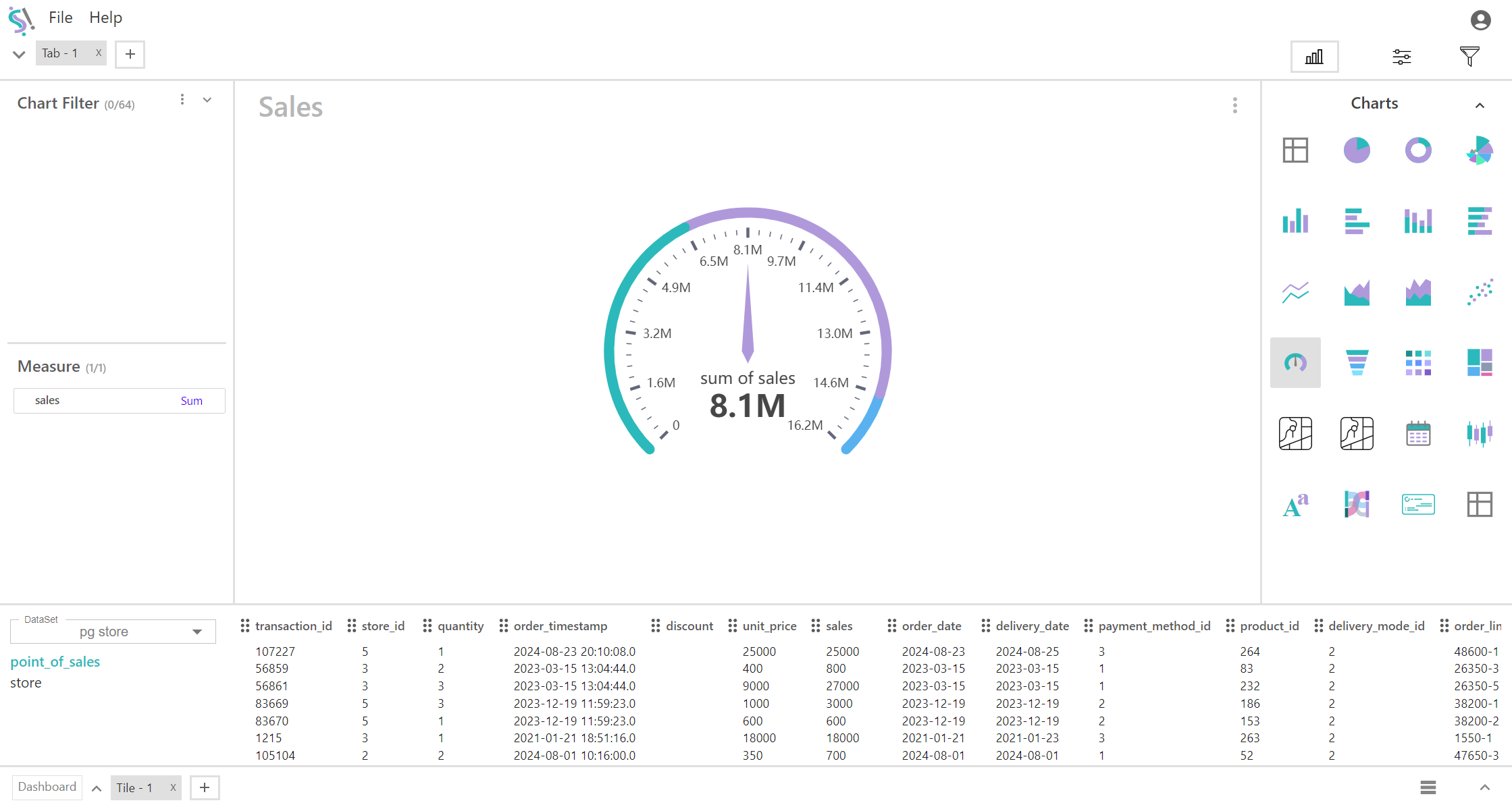
Gauge Chart
A gauge chart is a circular or semicircular data visualization that displays a value within a range using a needle or pointer. It is commonly used to show progress, performance, or a KPI in a format similar to a speedometer.
Key Field of a Gauge Chart
- Represents the single quantitative value that is displayed on the gauge. This is the primary data point you want to visualize. The measure is plotted as a single point on the gauge, indicating its position relative to the target or range. Shows how the current value compares to a predefined target or range, often highlighted with colors or indicators to illustrate progress or performance.
- Metrics such as sales revenue, completion percentage, temperature readings, or any other single value that you want to compare to a target.
Dial/Needle:
A pointer or needle that indicates the current value of the measure on the gauge. Moves along the arc of the gauge to point to the exact value of the measure. The needle or dial shows the actual measure value relative to the range and target, providing a clear visual representation of performance.
You can display a maximum of One measure in your chart/table.
When to Use a Gauge Chart:
- Ideal for tracking progress toward a specific goal or target. It provides a quick, visual representation of how well the measure is performing against the target.
- Useful for showing performance metrics in a concise manner. This helps in easily understanding whether the metric is within the desired range.
- Best suited when you need to display and highlight a single quantitative value and its comparison to a benchmark or target.