 Signin


Filled Map
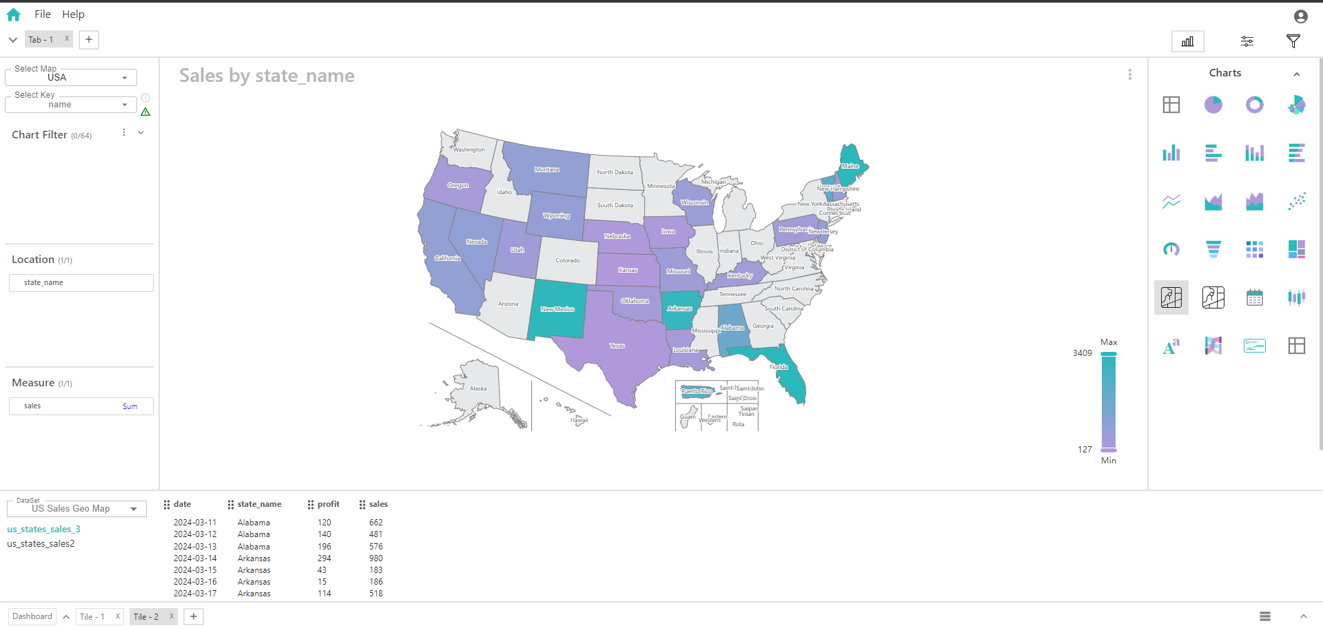
A filled map (choropleth map) is a data visualization tool used to represent data values across geographical areas by filling regions with colors or patterns. This visualization allows you to see how a particular measure varies across different areas within a specific location.
Key Fields of a Filled Map
- Defines the geographical area or scope in which the data is mapped. In this case, there is one location that serves as the context for the entire map. It determines the base area on the map where the data for the dimension will be visualized. The location could be a country, state, province, or any other defined region that contains various subdivisions or areas.
- City, region, continents
- Represents the categorical variable used to subdivide the location into different areas or regions, and it is used to fill these areas with colors based on the associated measure. Categories within the dimension are shown as different regions or subdivisions within the location. Helps in visualizing how different categories compare within the defined location.
- Sum of sales, profit
You can display a maximum of One Location and One Measure in your chart/table.
When to Use a Filled Map:
- Useful for visualizing how a categorical dimension (like states or regions) varies across a specific location.
- Helps in comparing the performance or metrics of different subdivisions within a location, such as comparing sales performance across different states.
- Effective for spotting trends and patterns within the geographical scope of the location.