 Signin


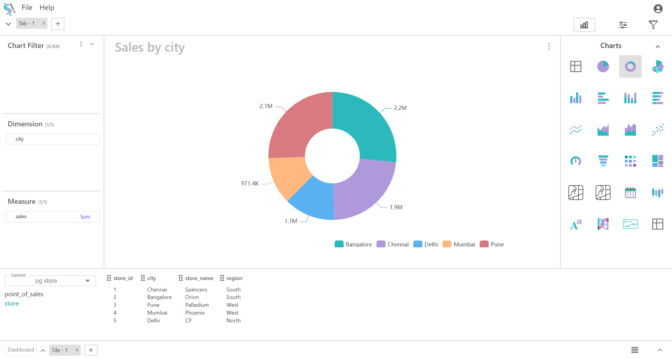
Donut Chart
A donut chart is a variation of a pie chart with a hole in the center, making it resemble a donut. Like a pie chart, it represents data in the form of slices that correspond to the proportion of categories in relation to the whole. The hole in the middle often serves to make the chart visually distinct or to display additional information, such as total values or labels.
Key Fields of a Donut Chart
- Represents the categorical variable that divides the chart into slices. Each category in the dimension corresponds to a slice of the donut.
- Geographical Dimensions: Country, state, city.
- The measure is the numerical value that determines the size of each slice. Measure refers to the quantitative variable that you are measuring. For instance, if you are showing sales, your measure could be the total sales amount for each region.
- Sales Figures: Total sales, sales revenue.
You can display a maximum of One Dimension and One measure in your chart/table.
When to Use a Donut Chart:
- Donut charts are often preferred for their aesthetic appeal, especially in dashboards and reports.
- They are effective for showing relative proportions, similar to pie charts, but with the added flexibility of placing text or values in the center.
- Like pie charts, donut charts work best with a small number of categories (usually fewer than 6-7) to maintain clarity.