


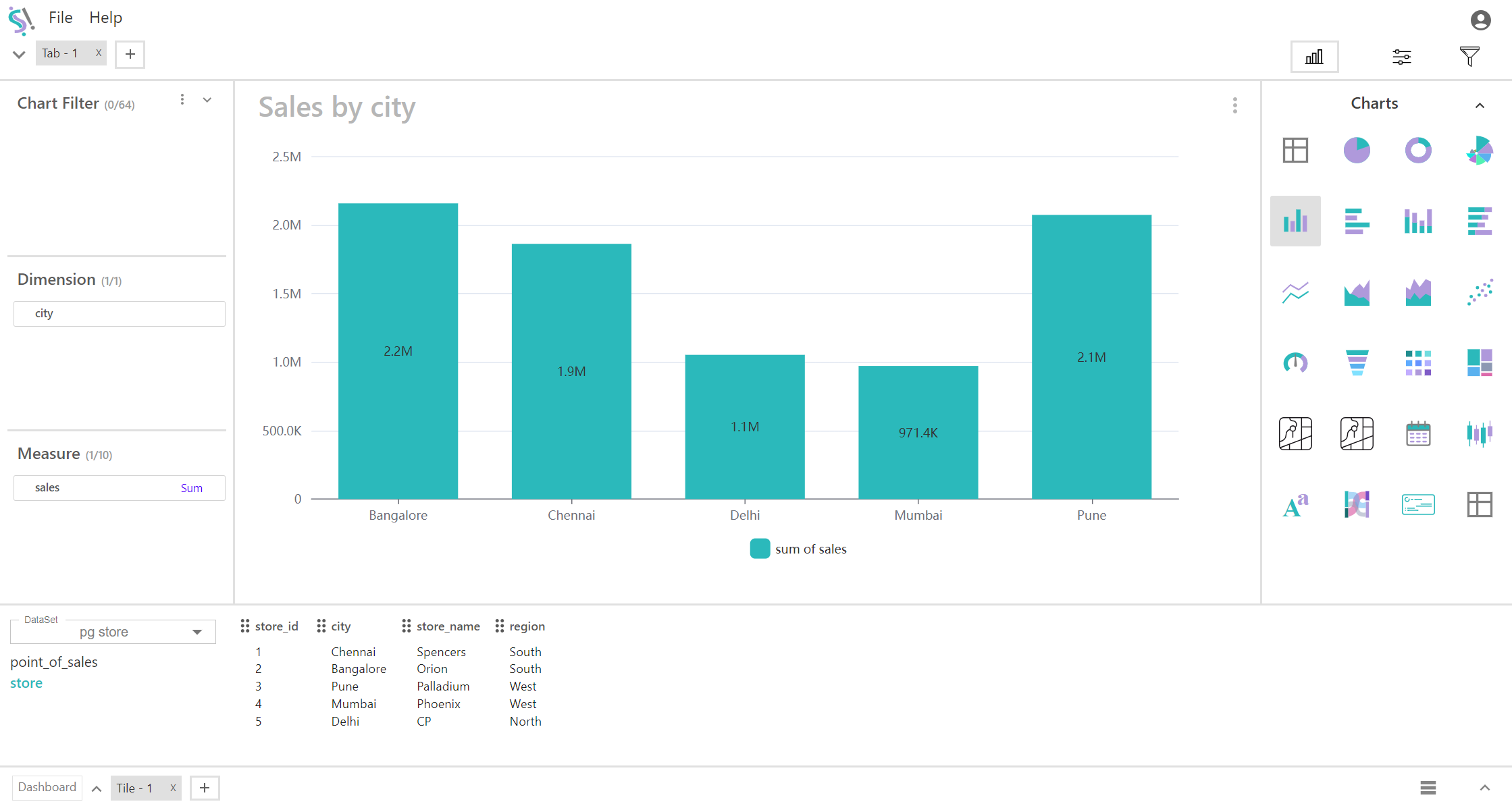
Multi Bar Chart
A multi-bar chart, also known as a grouped bar chart or clustered bar chart, displays multiple bars for each category in a single dimension. Each group of bars represents a different measure, allowing for easy comparison of multiple metrics within each category.
Key Fields of a Multi Bar Chart
- Represents the categorical variable that you want to compare across different bars. This field typically defines the categories or groups for which the data is being displayed.
- Categories such as product types, cities, regions, or time periods (e.g., months or years).
- Represents the quantitative variable that is plotted for each category in the dimension. This field determines the height or length of each bar in the chart.
- Metrics such as sales revenue, number of units sold, or any other numerical value.
You can display a maximum of One Dimension and Ten measures in your chart/table.
When to Use a Multi Bar Chart:
- Multi-bar charts are ideal when you need to compare multiple measures within each category of a single dimension. This setup allows you to see differences among the measures and understand how they vary within each category.
- They facilitate side-by-side comparisons of different measures within each category, making it easier to identify trends, patterns, and variations across the measures.
- Best suited for situations where each category (e.g., a time period, region, or product type) includes several metrics to compare, such as sales figures for different products or performance metrics across various periods.